

Overview
§0o|2z|3 \c|3o|3v|3i|3d|2 \1|29|1 \v|0i|0s|0u|0a|1l|1i|1s|2a|2t|2i|2o|2n|2s|1Column
Introduction
This web site is a joint effort of researchers at the South Western Sydney Clinical School and the Centre for Big Data Research in Health at the UNSW Faculty of Medicine, the Econometrics and Business Statistics Research Group of Monash University, and at the Ingham Institute for Applied Medical Research in Liverpool, Sydney.
![]()
![]()
![]()
![]()
The intent is to offer a range of principled epidemiological and statistical analyses and visualisations of current COVID-19 data which go beyond the now ubiquitous world maps and cumulative incidence charts.
The broad themes for the analyses and visualisations currently available are listed in the menu at the top of this page – more will be added in due course. For each theme there is an introductory page explaining the motivating ideas and methodology employed for each of the visualisations or analyses for that theme, which are available in the subsequent frames (the series of rectangles at the top of each page). Additional notes or commentary appear on the right of some pages.
The time-series line in the heading above is derived from current incidence cases of COVID-19 in Australia.
An Australian focus with an international perspective
This site has been created by researchers at Australian universities, and hence the focus is on the situation in Australia, within the broader international context – we are, after all, all in this together. However, we hope that some of the analyses and visualisations on this site might be useful elsewhere, and to that end, all the R source code used to create this site if freely available – please see the Technical details tab above for details on software used, and where to find the source code.
Incidence
Explanation
Incidence is the epidemiological term for the number of cases of a disease meeting some case definition in a specified time period. Here we present the daily incidence – that is, the number of new cases each day – of COVID-19 for a range of countries, including Australia, of course. Each country may be using a slightly different case definition, although most of the countries presented here have been using case definitions aligned with those recommended by the WHO. Three types of case definition are used, simultaneously:
- Suspected cases
- Probable cases
- Confirmed (by laboratory test) cases
All of the data reported here are for confirmed cases, with a few exceptions – China included cases diagnosed via lung CT scan for a few days in February, 2020, but we have adjusted the data for those days as far as possible to remove that anomaly.
The data are drawn from the European CDC, which has collected data from various governing agencies around the world. There are some small discrepancies between these data and those given by the Australian government, and indeed other national governments, due to timing issues relating to when cases are tabulated each day, and so on. However, we believe the the European CDC to be the best source of automatically downloadable, machine-readable data there is right now.
Note, however, that because the confirmed case definition depends on laboratory confirmation, it is influenced by the number of lab tests (RT-PCR, reverse transcriptase polymerase chain reaction tests on nasopharyngeal swabs or sputum) done by each reporting country or jurisdiction. Obviously the number of reported cases is bounded by the number of such labs tests which are done, but the degree of under-ascertainment is also affected by the policies in place which determine which potential COVID-19 cases are tested. These policies are completely country-specific and have changed over time.
Another issue with these data is that it is vastly preferable to analyse incidence by (presumed or definite) date of onset of symptoms, rather than by date of notification or date of reporting. There may be variable delays in the processing of laboratory tests and the reporting of cases to central authorities. Tabulation of incidence counts by date of onset overcomes this problem. Almost all national and jurisdictional health authorities will be collecting data on presumed date of onset for each case (although, inexplicably, it is not one of the data items on the WHO-recommended data collection form). One reason for not using date of onset is that it may be incomplete, but this ignores the fact that statistical imputation can be used to validly fill in those missing dates of onset. There are also a body of methods, collectively known as nowcasting, that use multivariate time-series models to convert data tabulated by date of notification/reporting to (estimated) date of onset. If national or jurisdictional health authorities do not have the technical capacity to undertake such value-adding to their own data, they should make the required data available to trusted partners in the academic sector who can undertake such statistical manipulation for them (or help authorities implement such processing internally).
Cumulative Incidence
Cumulative incidence is, as the name suggests, just the cumulative sum of the daily incidence - that is, a running total of the number of cases. Reporting of cumulative COVID-19 seems to dominate the mainstream media, but it has many disadvantages. In particular, a cumulative sum of case counts is always monotonically increasing – it can only ever go up, or at best, remain flat if there are no new incident cases. This tends to obscure the rate of change in incidence over time – subtle, or even large changes in the slope of the cumulative incidence curve are difficult to see.
Semi-log cumulative incidence chart
The first chart presented here is a semi-log cumulative incidence chart. This chart seems to have been popularised by John Burn-Murdoch in the Financial Times, but it appears it was first used by Matt Cowgill from Australia’s very own Grattan Institute. It has since been widely copied and reproduced. Please see a blog post by Prof Rob Hyndman for further discussion of this chart, and some alternative analyses.
There are several variations on the Grattan chart presented, please see the notes for each one.
Epicurves
The epicurve is perhaps the most-used chart in field epidemiology and outbreak control. It is simply a chart of daily (or weekly, for slower-moving diseases) incidence (new cases), traditionally shown as a bar chart. It gives an immediate sense of whether an outbreak or epidemic is in a growth phase, with increasing incident counts each successive day, or in a decay phase, with decreasing counts each successive day. Note that the cumulative count will still increase, day-on-day, even when an outbreak or epidemic is in a decay phase. Only when the epidemic has been completely extinguished will the cumulative incidence stop increasing. That’s one of the reasons why cumulative incidence charts are rarely used by epidemiologists.
Three variations of epicurves are provided here:
- the usual epicurve, on a linear y-axis, and with the ranges specific for each country to maximise the amount of detail discernible.
- the usual epicurve, on a linear y-axis, but with the same y-axis scale across all countries, which clearly shows the relative incidence in each country. This chart is quite startling!
- the same chart, but with a logarithmic y-axis, which allows the periods with lower counts to be inspected in greater detail.
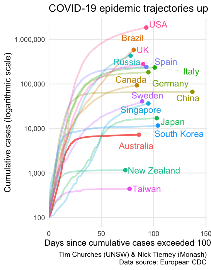
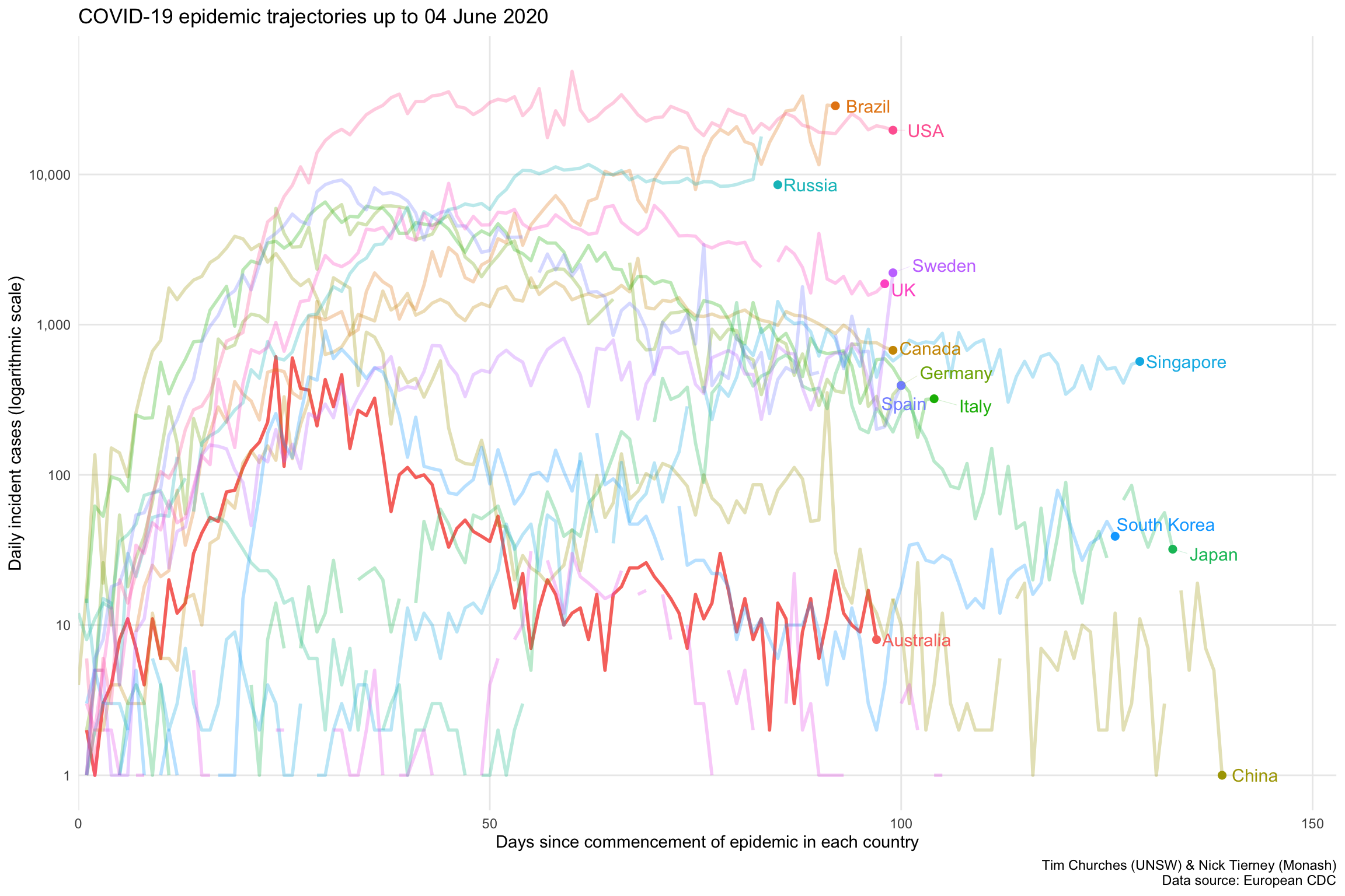
Semi-log cumulative incidence for selected countries – the Grattan Institute chart
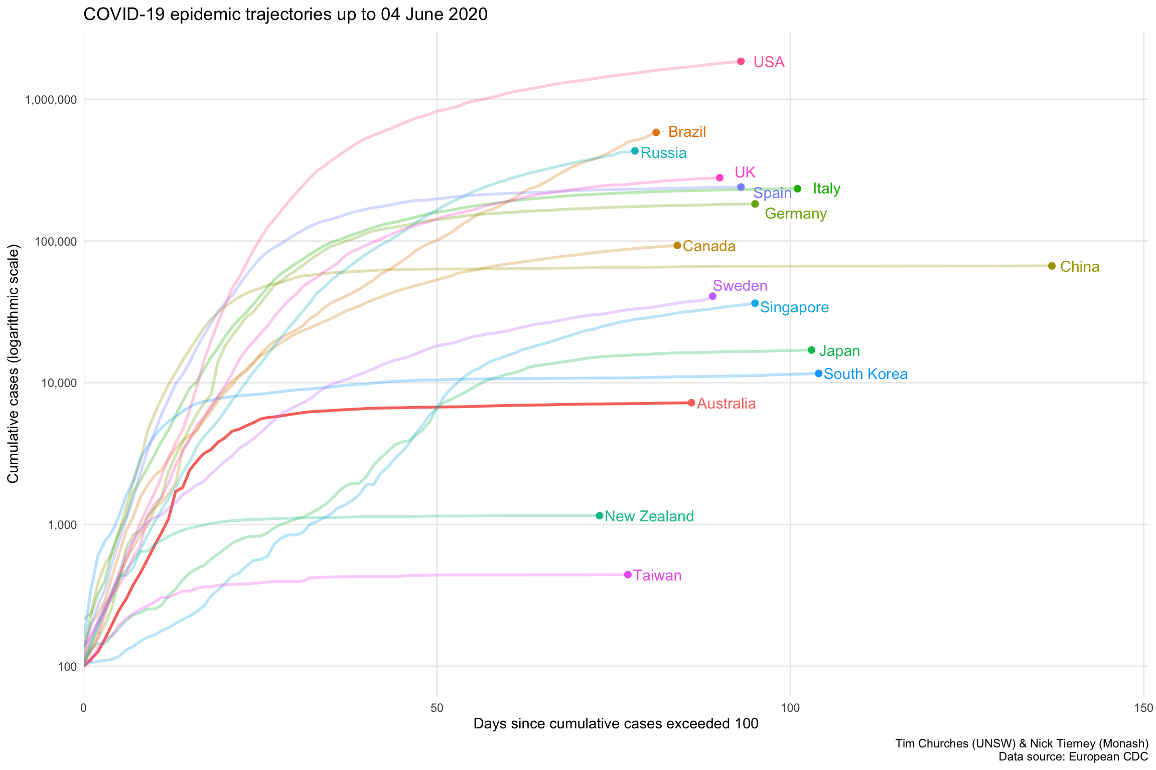
This chart, developed and poularised by the Grattan Institute and the Financial Times, shows the cumulative cases of COVID-19 for selected countries on a logarithmic y-axis scale, with the dates on the x-axis normalised to the number of days since each country shown exceeded 100 cumulative cases, on a linear x-axis scale (hence the name semi-log, since only one of the two axes is logarithmic).
Note that countries “peel off” the diagonal trajectory as their rate of new (incident) cases reduces. If the line for a country is almost horizontal, it means there are almost no new cases occurring there.
The curve for Australia is clearly flattening, and we are keeping good company with China, South Korea, Taiwan and New Zealand as the other countries with nearly horizontal trajectories. Note that after considerable initial success in containing COVID-19 spread, both Japan and Singapore are now on a upwards trajectory, but the slopes of those trajectories are much shallower than the other countries shown, indicating much slower spread.
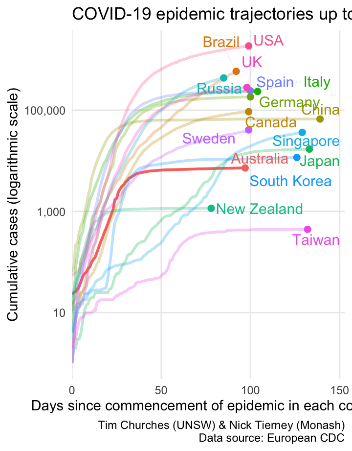
Semi-log cumulative incidence for selected countries – aligned to start of epidemic in each country

This chart is a variation on the previous Grattan Institute chart. It isn’t really an improvement on the Grattan chart, but is shown here to illustrate the sensitivity of the Grattan chart to the method used to align the dates on the x-axis. In the chart shown at left, the dates on the x-axis are aligned to the approximate start of the COVID-19 epidemic in each country. The start dates are chosen automatically using a non-parametric changepoint detection algorithm, (see the changepoint.np package for R). The changepoints for each country shown are as follows:
| Country | Detected start of epidemic |
|---|---|
| 2020-01-17 | China |
| 2020-01-23 | Japan |
| 2020-01-24 | Taiwan |
| 2020-01-27 | Singapore |
| 2020-01-30 | South Korea |
| 2020-02-21 | Italy |
| 2020-02-24 | Spain |
| 2020-02-25 | Germany |
| 2020-02-26 | Canada |
| 2020-02-26 | Sweden |
| 2020-02-26 | USA |
| 2020-02-27 | UK |
| 2020-02-28 | Australia |
| 2020-03-04 | Brazil |
| 2020-03-11 | Russia |
| 2020-03-18 | New Zealand |
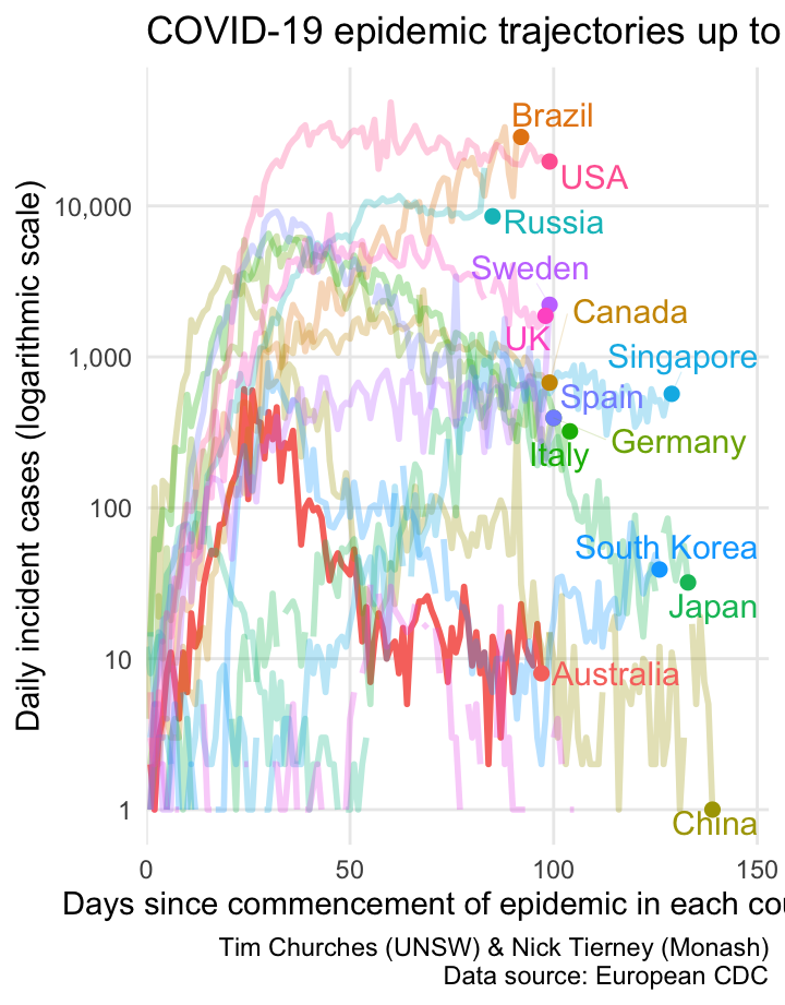
Semi-log daily incidence for selected countries – aligned to start of epidemic in each country
This is another variation on the Grattan Institute chart, but this time howing daily incidence on the y-axis, rather than daily cumulative incidence. It is basically the same information as shown in the epicurve charts in the subsequent frames (accessed via the blue rectangles at the top of the page), but all of the selectsed countries are shown on one plot, and the dates are aligned by the detected start of the epidemic in each country.
One problem is that the daily incidence curves are rather noisy (with missing values for some countries). We can address that by smoothing them, as shown in the next frame.
Semi-log smoothed daily incidence for selected countries – aligned to start of epidemic in each country
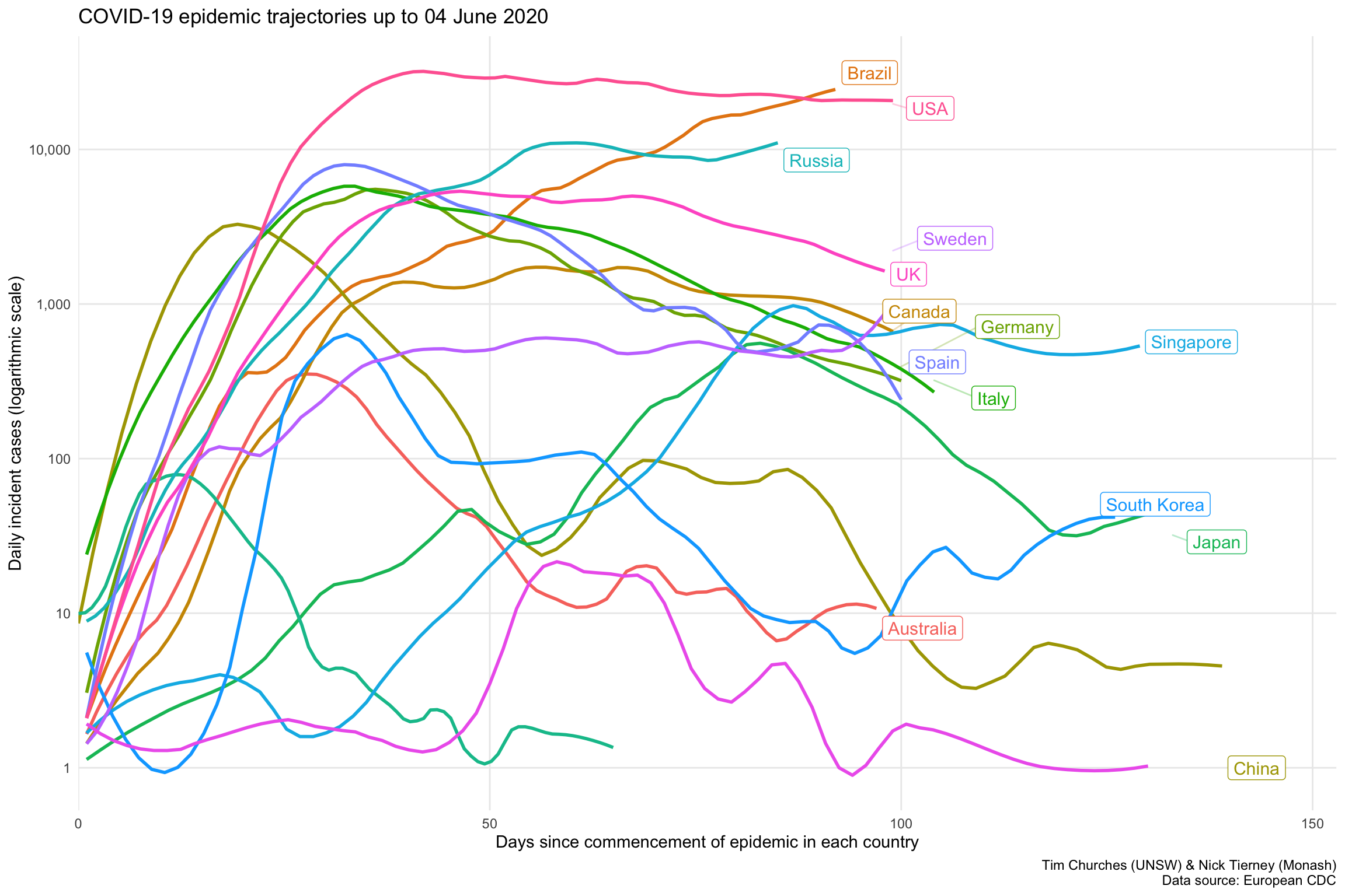
In this chart (see discussion in previous frame), we can now discern three distinct groups of countries:
- an upper group of the USA, Russia and Brazil, where the epidemic is still growing rapidly.
- a middle group comprising the UK and European countries
- a lower group, which includes Australia , New Zealand, South Korea, Taiwan, mainland China, Japan and Singapore, which all have their local COVID-19 epidemics under control (but definitely not eliminated). Note however that Japan and Singapore are now exiting that lower group and heading upwards.
Log-log incidence versus cumulative incidence animation
This plot replicates a chart developed by Aatish Bhatia in collaboration with Minute Physics. The plot shows, for each country, the number of incident (new) cases on the y-axis, on a logarithmic scale, versus the cumulative total of cases on the x-axis, also on a logarithmic scale. When plotted in this way, uncontrolled epidemics with exponential growth take a linear (straight line) trajectory at some angle. As an epidemic is brought under control, the trajectory drops below the straight line, eventually falling vertically if the epidemic has been completely extinguished.
This is just an alternative visualisation of the data shown in earlier frames, but it looks pretty and in this case the animation is actually helpful, because it shows time, which is not otherwise one of the explicit dimensions of the chart.
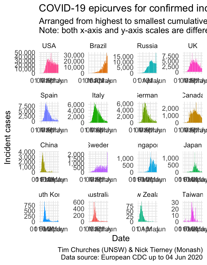
Epicurves for selected countries
The charts shown here are epicurves – that is, daily count of incident (new) cases, using data collated by the European CDC. It is easy to see when (or whether) the epidemic in each country entered a decay phase and the daily incidence started to decline (although the cumulative incidence will, by definition, continue to increase during the decay phase until the epidemic is completely extinguished).
Note that there are some days where the number of cases appears to spike upwards, followed by a decrease the following day. This indicates that there may be some data discrepancies in how the European CDC is capturing data from WHO Situation Reports. It underlines the importance of nations providing reliable machine-readable access to their own COVID-19 data. By “machine-readable” we mean CSV or JSON data files which are automatically downloadable, or an API which can be queried automatically to yield such data. Neither of those are difficult to establish, yet nearly all national governments have failed to provide such data, leaving it to third-party agencies and citizen-science efforts to piece together the required data in a manner that permits ongoing analysis. There is, for example, no official machine-readable source of national COVID-19 data provided by the Australian government. As far as we are aware, NSW is the only State or Territory government that has made any effort in that direction by providing some machine-readable data, which we leverage in the \(R_{t}\) for NSW theme (see menu above).
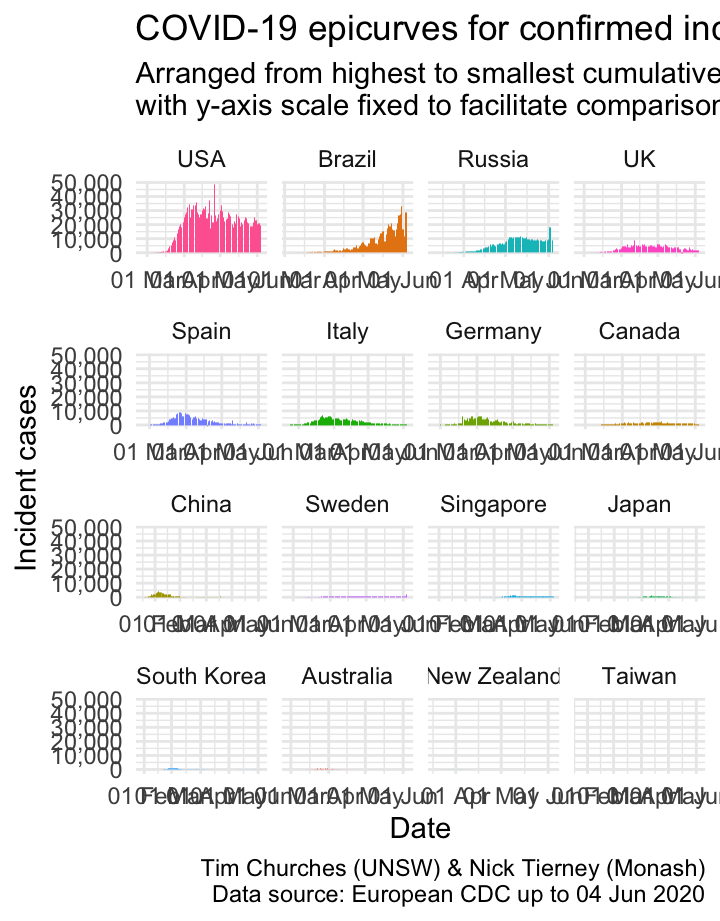
Epicurves for selected countries (common y-axis scale)
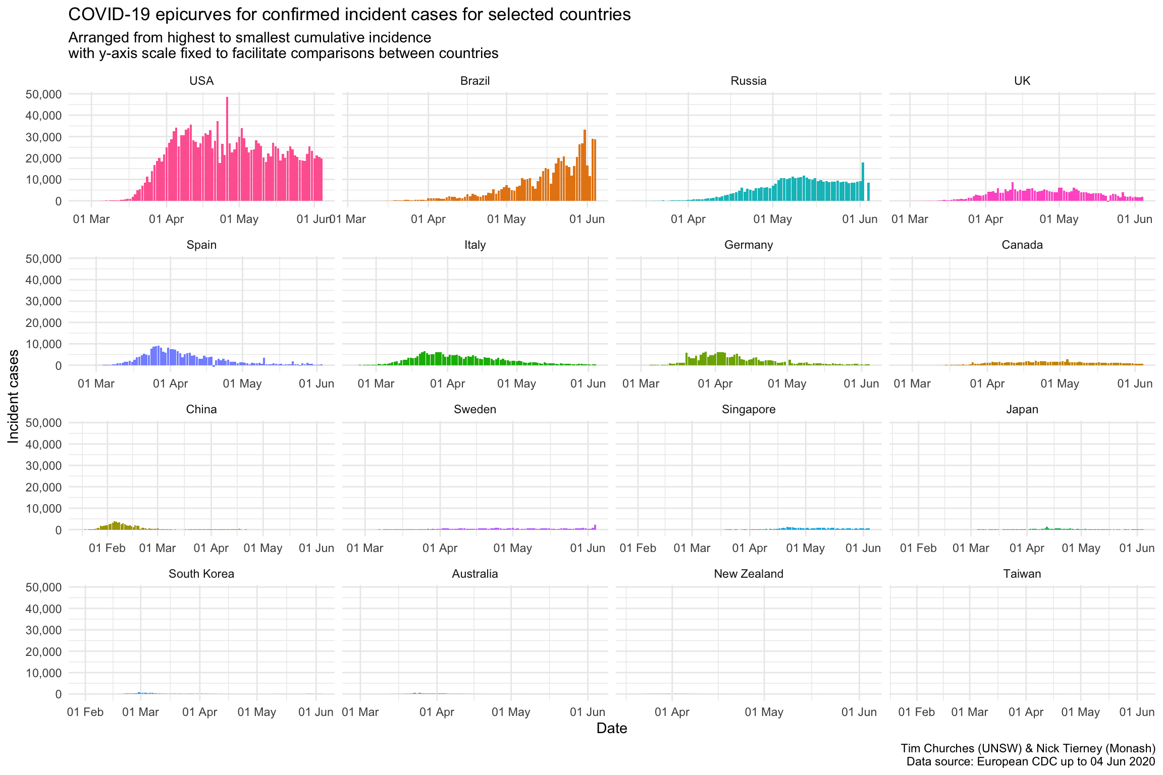
Forcing the y-axis scale to be the same for all the plots in this chart means that, compared to the previous chart where the y-axis could change for each country, the country with the largest number cases, in this case, the USA, appears the same, and the rest of the plots appear smaller.
This provides important context: the number of cases in the USA currently dominates relative to other countries. The bottom row of countries are barely visible, by comparison.
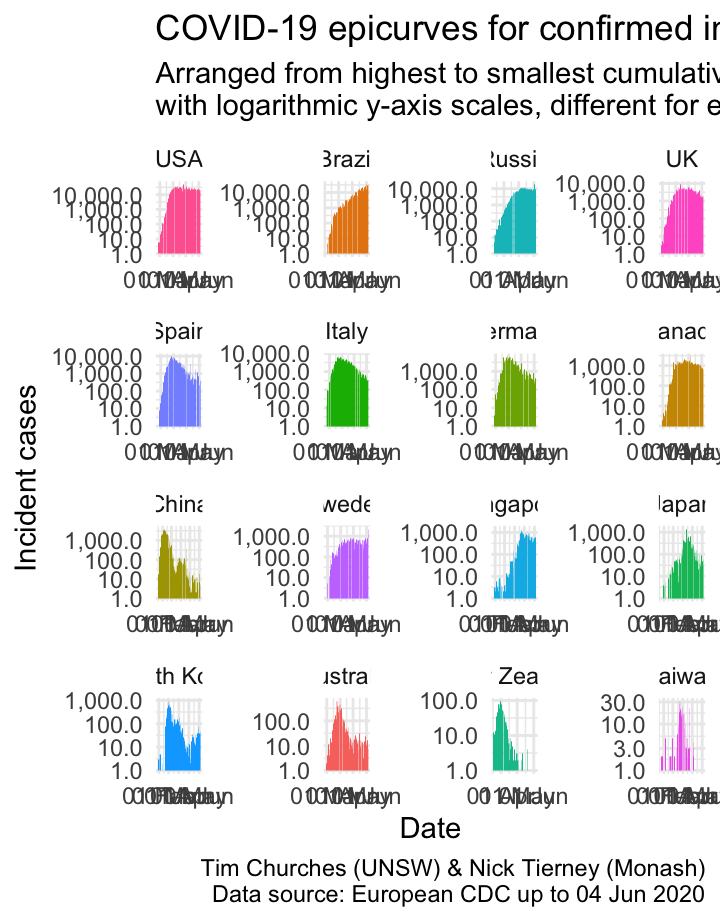
Epicurves for selected countries (logarithmic y-axis scale)
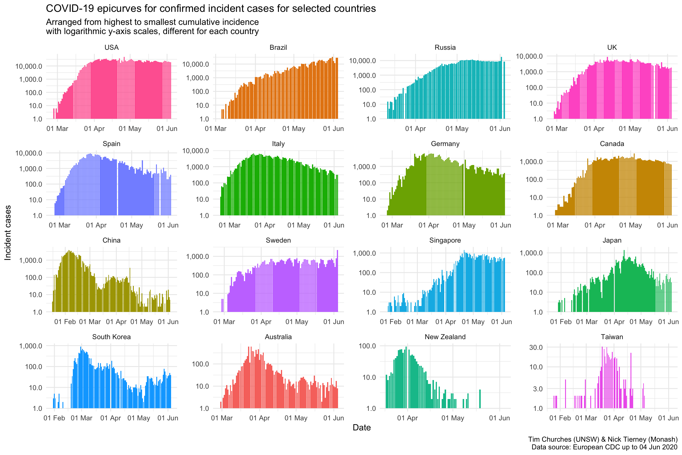
The final variation the epicurve chart, show here, uses a logarithmic y-axis scale. This emphasises lower counts, which is useful for inspecting the beginnings and ends of the epicurves, or the middle parts where there is more than one “wave”, as in China and Singapore.
National-level \(R_{t}\)
The reproduction number
The basic reproduction number \(R_{0}\)
A key statistic in field epidemiology is the basic reproduction number, often referred to as “R-zero” or “R-nought”, and written \(R_{0}\). This is the number of people we expect each new case of a disease such as COVID-10 to infect – in other words, how many people each case passes the disease on to – at the beginning of a disease outbreak or epidemic, before any public health controls or interventions have been established or put in place.
\(R_{0}\) was popularised in the 2011 film Contagion. Here is Kate Winslet, who plays a US CDC epidemiologist, explaining \(R_{0}\) (with a few errors – it’s reproduction number, not “reproductive rate” as she say) to government officials:
As explained in the film clip above, \(R_{0}\) is determined by a number of factors, but is a very useful metric of how fast a communicable disease will spread in a population, if nothing is done to stop or slow it. Note that \(R_{0}\) is not solely a characteristic of a pathogen (such as a virus) per se, but rather depends on the nature and biological behaviour of the pathogen, but also how it is transmitted, how often members of the population engage in behaviours that may transmit it, population density, whether any members of the population are immune or resistant to the disease, and so on. In other words, \(R_{0}\) is highly situation-specific.
As such, \(R_{0}\) is useful in the early stages of an epidemic, but as soon as (effective) public health interventions have been put in place to slow the spread of the disease, the reproduction number will change. The statistice is then referred to as the effective reproduction number, denoted \(R_{t}\), where \(t\) stands for time. In other words, \(R_{t}\) is the reproduction number at a particular point in time, \(t\).
What are the implications of the effective reproduction number?
If \(R_{t}\) equals 1.0
- Each infected person spreads the disease, on average, to one other person during the course of their illness (which ends when they either recover or die). Therefore, in the long-run, the number of infected people neither grows nor shrinks. From day-to-day there may be some variation, but overall the number of new infections stays the same.
If \(R_{t}\) is greater than 1.0
- Each infected person spreads the disease, on average, to more than one other person during the course of their illness. Each of those spread the disease to more than one additional people, and so on. It is easy to see that this results in a growing number of new infections each day, and that growth rate itself also grows – the so-called exponential growth of an epidemic (at least in its early stages). If \(R_{0}\) initially, or \(R_{t}\), later, is only just greater than 1.0, then the disease spreads only slowly, but if the reproduction number is well above 1.0, say, 2.0 or more, then rapid spread results.
If \(R_{t}\) is less than 1.0
- Each infected person spreads the disease, on average, to fewer than one other person during the course of their illness (obviously each person spreads it to a whole number of other people, e.g., zero, one, two, three, but on average, taken across a large number of infected individuals, the number infected by each person with the disease is less than one. Again, it is easy to see that this results in a falling number of new infections each day, and that rate of decay in the number of new infections also decays – in other words, epidemics decay exponentially too. As an aside, just a epidemics tend to grow much more quickly than most people expect – humans tend to reason using linear heuristics – so do epidemics decay much more slowly that people expect, for the same reason – humans assume linear behaviour, which does not (necessarily) apply to communicable disease dynamics.
Estimating the time-varying effective reproduction number \(R_{t}\)
We estimate the effective reproduction number \(R_{t}\) using a statistical model which was developed in 2013 by Anne Cori and colleagues at Imperial College London (ICL). The method was later extended by Thompson and colleagues (including Anne Cori), also at ICL. We won’t go into the details of the model here – they are described in details in the cited papers – but we will remark on a few key points that need to be born in mind when interpreting these statistics.
The methods we use here estimate the instantaneous effective reproduction number, which is is the average number of secondary cases that each infected individual would infect if the conditions remained as they were at time t. In that respect, it is analogous to current life expectancy (which is the one usually calculated), which is the length of time someone is expected to live if the age- and sex-specific death rates as they currently are persist, unchnaged, into the future.
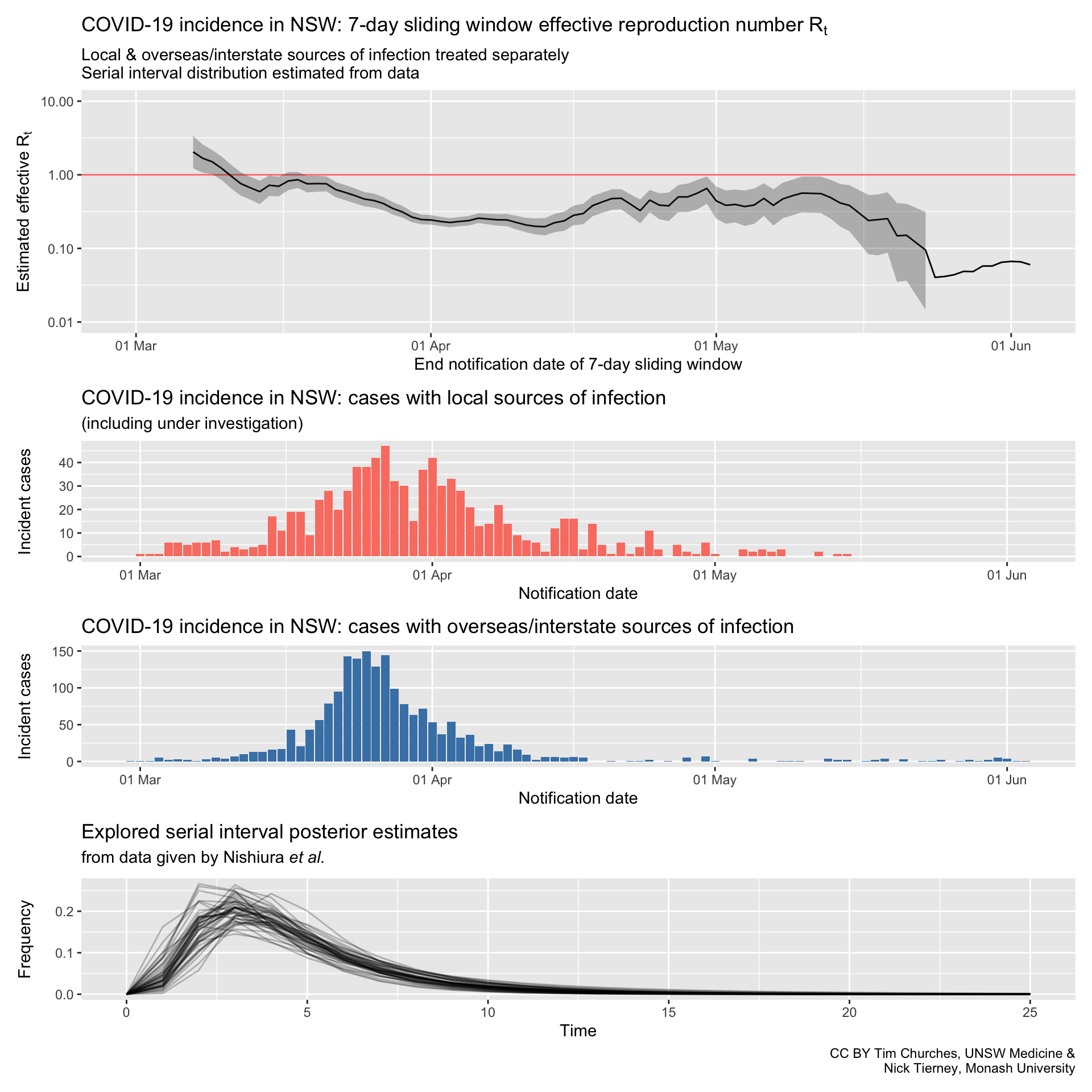
The reproduction number is an estimate of the spread of an infection in a specific, local population, and thus we should really only use counts of incident (new) infections which are the result of local spread – that is, we should not include cases which were acquired elsewhere, such as overseas or interstate, when estimating it. Doing so will bias our estimates of \(R_{t}\) upwards while (in rough terms) the incidence of such cases is increasing, and downwards when they slow or stop. In fact, the estimation method used here can make proper use of both incident counts of imported cases and separate counts of locally-acquired cases. Unfortunately, very few jurisdictions have released data which enable that distinction, between imported and locally-acquired cases, to be made, and so we just use total incidence for the estimates shown in this section. However, incident counts of cases, split into imported and locally-acquired counts, is available from NSW Health, and we report on those, much better data in the next section (see menu at top of page).
We use a seven-day trailing sliding window of incidence case counts to calculate the current \(R_{t}\) estimate. Thus, for each date, the estimate is based on the count of incident cases on that date and for the six days prior to that. This is done to smooth the estimates and provide greater precision for each estimate.
The estimation procedure uses Bayesian methods, and we display the median estimate of the posterior distribution of the estimated \(R_{t}\), as well as the 95% credible interval in some of the charts.
Estimation of the effective reproduction number should really use incidence data tabulated (aggregated) by date of symptom onset, not date of reporting or date of notification (to the relevant health authority). Please see the explanatory notes in the previous section on incidence for further discussion of this data gap, and how health authorities could readily address it.
Estimates of the reproduction number depend critically on using the correct distribution for the serial interval. The serial interval is the interval between the onset of symptoms in a case and the onset of symptoms in those infected by that case. In other words, the differences between the time (or date) of onset of an infector and the times or dates of onset of its infectees. Not every pair of infector-infectee cases will have the same serial interval, even for the same infector case. Thus, the serial interval is not a single number, or even a range, but rather a statistical distribution. It is often expressed or summarised as the mean and standard deviation of an idealised distribution, typically a discrete \(\beta\) distribution, a discrete Weibull distribution or a log-normal distribution. In the charts in this section, we have used samples from the Bayesian posterior distribution for the serial interval derived from the observed serial interval pairs for COVID-19 published by Nishiura et al.. Note that the resulting set of samples have a mean which is shorter than most estimates of the incubation period of COVID-19, which is indicative of asymptomatic transmission – that is, some cases of COVID-19 infection transmit the infection to others before they themselves start to experience symptoms of illness. That also explains the real difficulties in controlling the spread of the SARS-CoV-2 virus which causes COVID-19.
Further discussion of serial interval estimation and calculation of the effective reproduction number can be found in this technical blog post.
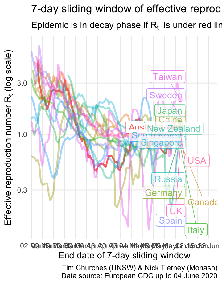
\(R_{t}\) for selected countries on a single plot
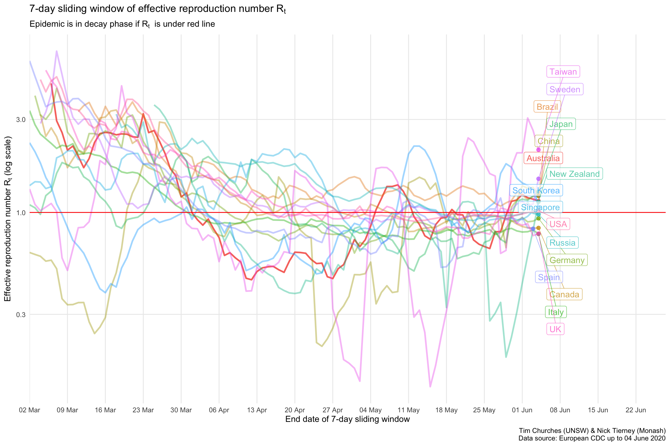
The \(R_{t}\) estimates for each country indicate that most countries are bringing the spread of the virus under control or have brought it under control, with the exception Brazil.
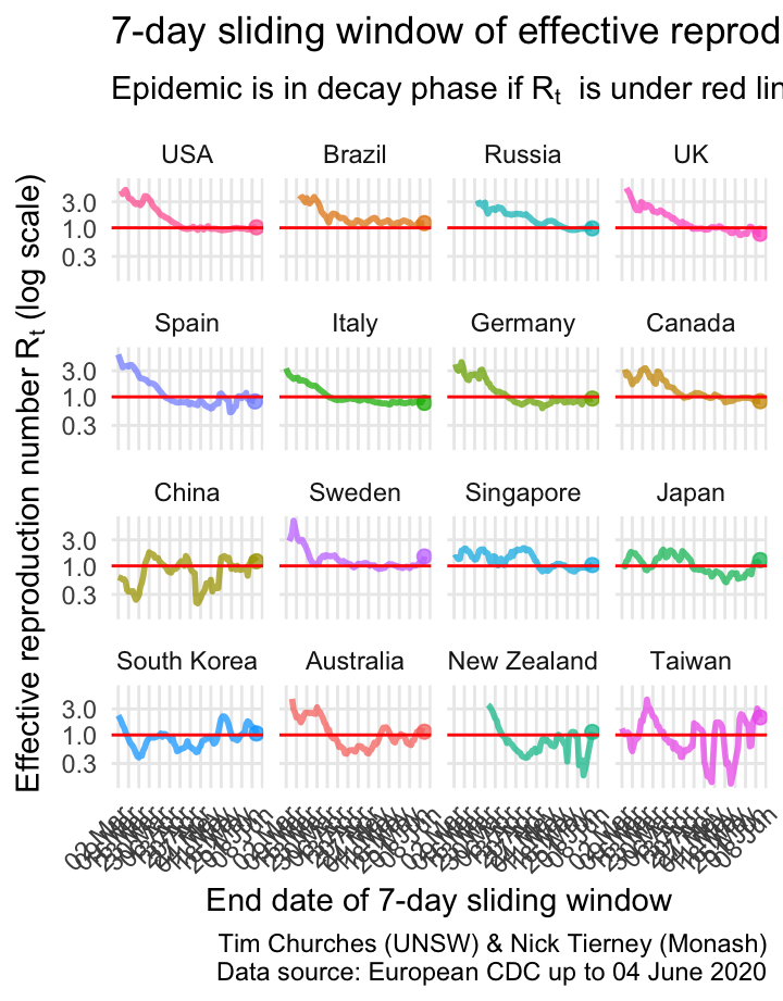
\(R_{t}\) for selected countries as facetted plots
This is the same information presented as in the previous graphic, but with each country split into its own graph. This allows us to see the trajectories of effective R for each country more easily.
Most countries are decreasing, but we notice that Japan and Singapore are rising, due to recent recrudescent outbreaks.
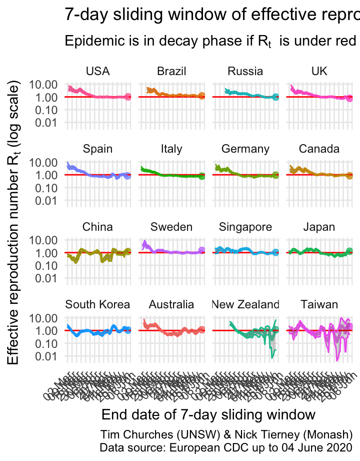
\(R_{t}\) for selected countries as facetted plots with 95% credible intervals shown
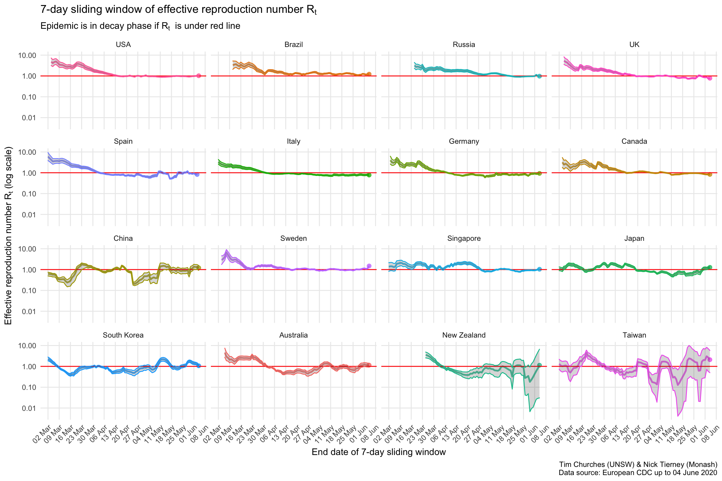
This shows the uncertainty around the median estimates of the effective reproduction number. The grey bands either side of the median estimate indicate the area in which we are 95% certain the true estimate lies (note: these are Bayesian, not frequentist estimates).
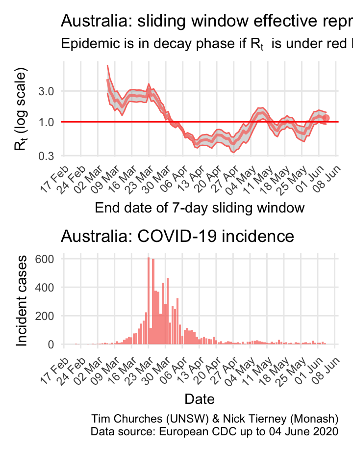
Australia: \(R_{t}\) and incidence
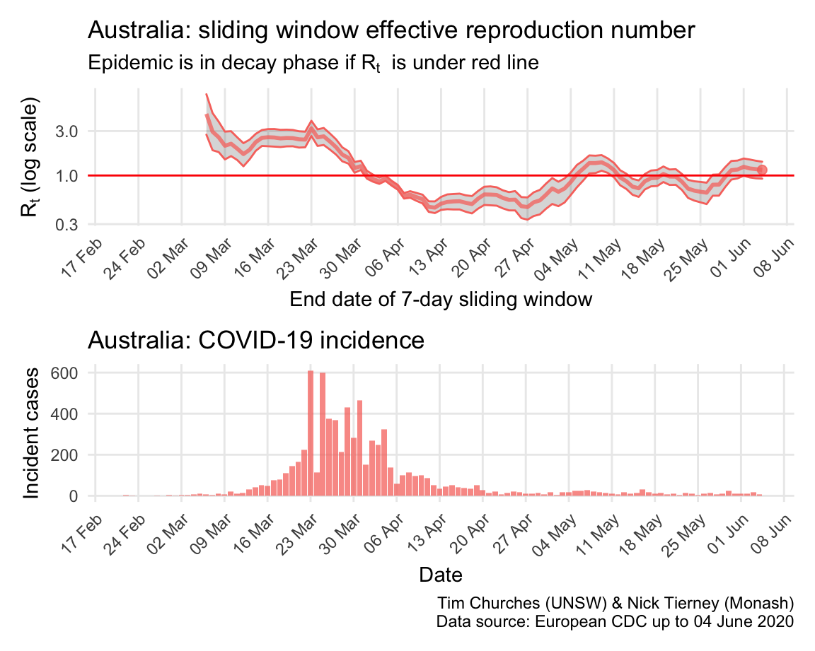
The \(R_{t}\) for the COVID-19 epidemic in Australia appears to have been in decay since about 23rd March. Note that Australia effectively closed its borders to all non-residents on 19th March, and implemented nation-wide social distancing recommendations on 21st March, and state governments began to close non-essential services on 22nd March.
The estimates here use samples from a posterior distribution of serial intervals estimated from the data given by Nishiura et al. using the method of Thompson et al.
Japan: \(R_{t}\) and incidence
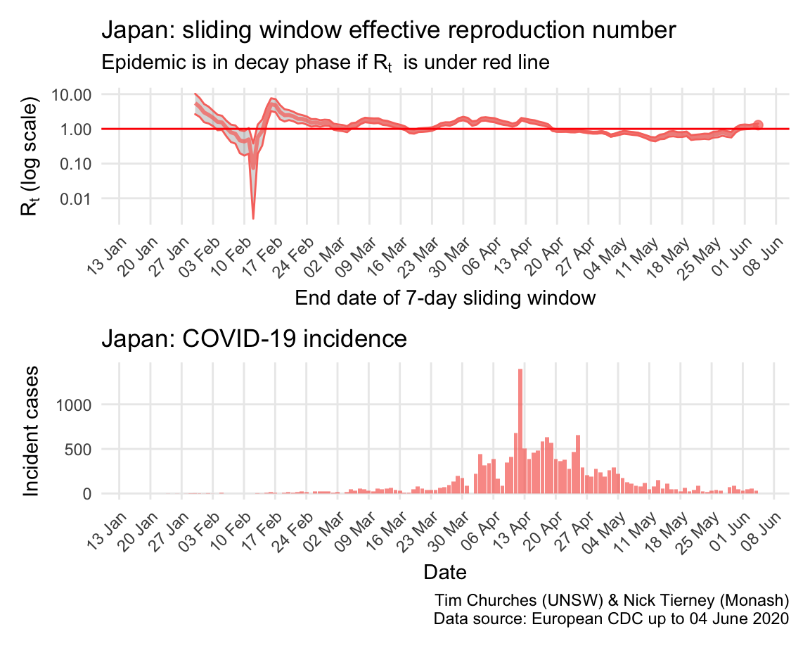
By contrast, Japan appears to have managed the early stages of the epidemic well, but failed, due to lack of enabling legislation, to implement strict social distancing nationwide. This may have contributed to the “escape” of the epidemic around 23rd March. Since then, Japan has struggled to regain control, although emergencies have now been declared in many Japanese prefectures, which have resulted in better containment of spread.
The estimates here use samples from a posterior distribution of serial intervals estimated from the data given by Nishiura et al. using the method of Thompson et al.
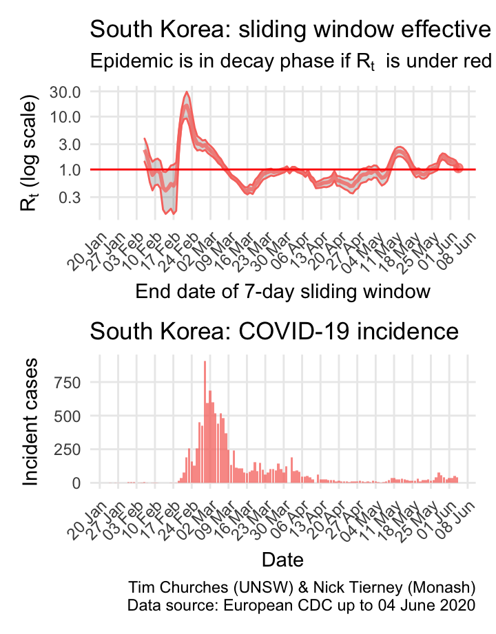
South Korea: \(R_{t}\) and incidence
South Korea is a model of how to fight COVID-19. After initial, very fast growing outbreaks centred in Daegu, the South Korean authorities moved swiftly to implement very efficient and thorough case and contact tracing with rigorous isolation of cases and quarantining of contacts, plus extensive social distancing measures in affected areas. Within a month they had brought the epidemic under control, and have been able to keep it in decay since 9th March, with the exception of a short-lived outbreak in nightclubs in Seoul as soon as social disatncing was relaxed, now contained.
The estimates here use samples from a posterior distribution of serial intervals estimated from the data given by Nishiura et al. using the method of Thompson et al.
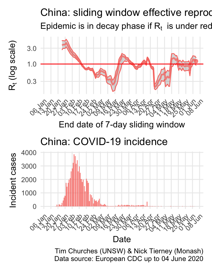
China: \(R_{t}\) and incidence
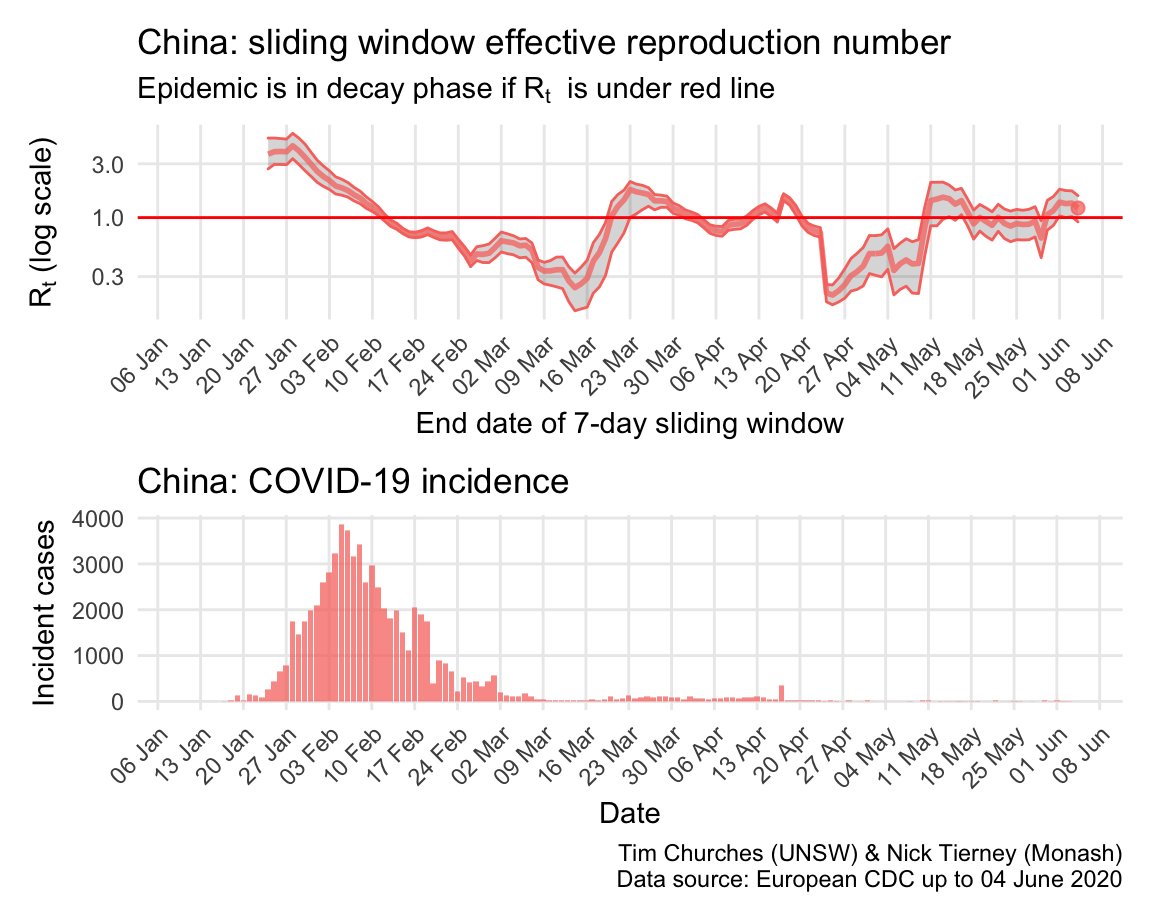
China stunned the world, or at least it stunned epidemiologists and public health practitioners everywhere, when it closed the city of Wuhan, and then the entire province of Hubei, on 24th January. The result was that within a few weeks the epidemic was in decay, and that decay has accelerated due to door-to-door case-and-contract tracing efforts. Small outbreaks around teh country, including in Wuhan, have all been rapidly contained.
As COVID-19 epidemics began to become apparent in other countries in March, resulting in the repatriation of Chines nationals, there was an increase in the \(R_{t}\) estimated here, because it is not possible to separate those imported cases from ongoing local transmission. Thus, at least some of the “bump” in the estimated \(R_{t}\) around 23rd March is an artefact of inadequate data.
The estimates here use samples from a posterior distribution of serial intervals estimated from the data given by Nishiura et al. using the method of Thompson et al.
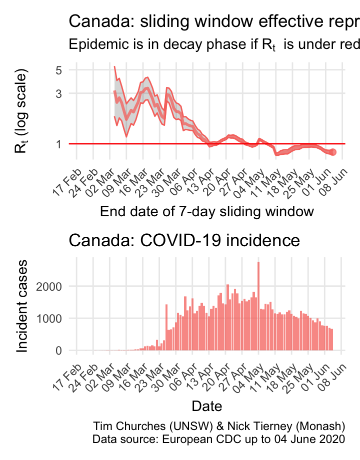
Canada: \(R_{t}\) and incidence
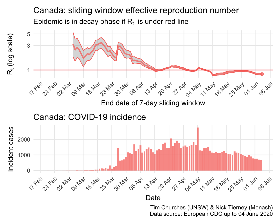
Canada clearly suffers from sharing a long border with the US, but nonetheless appears to almost have its COVID-19 epidemic under control.
The estimates here use samples from a posterior distribution of serial intervals estimated from the data given by Nishiura et al. using the method of Thompson et al.
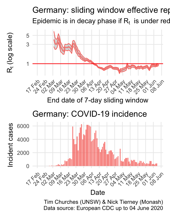
Germany: \(R_{t}\) and incidence
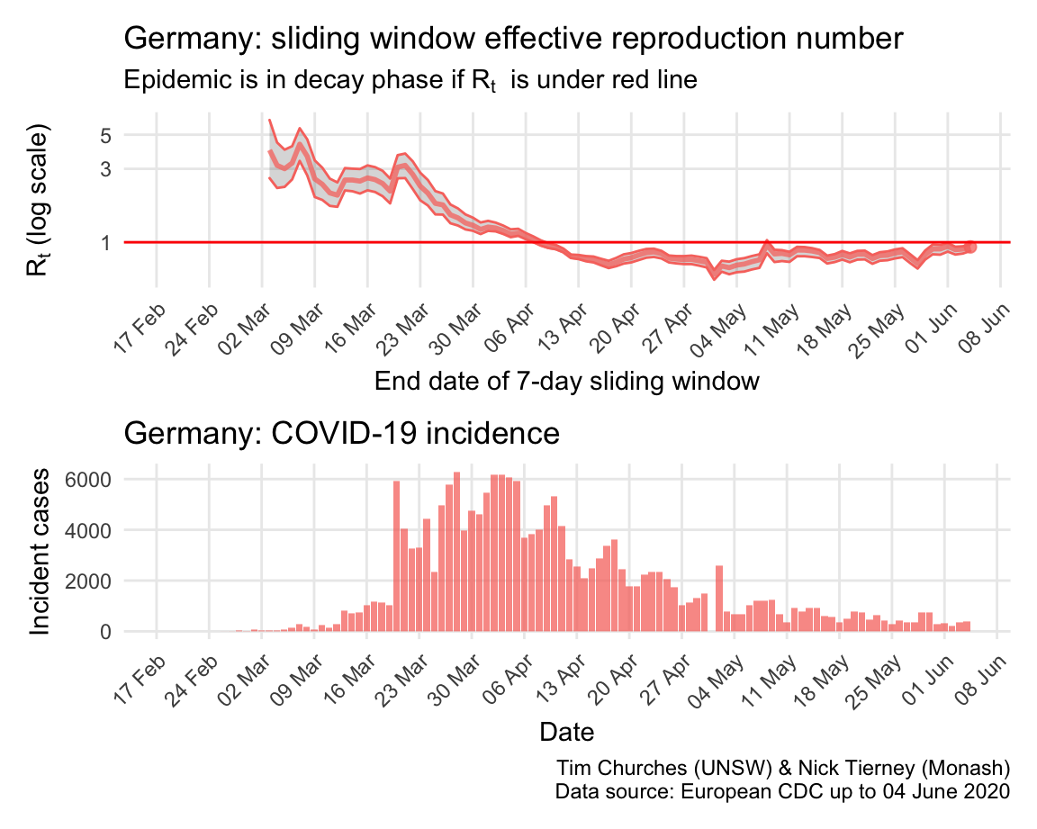
Italy, Spain, France and Germany have all suffered large epidemics of COVID-19, but all appear to have now contained spread to the point that their epidemics are now clearly in decay.
The estimates here use samples from a posterior distribution of serial intervals estimated from the data given by Nishiura et al. using the method of Thompson et al.
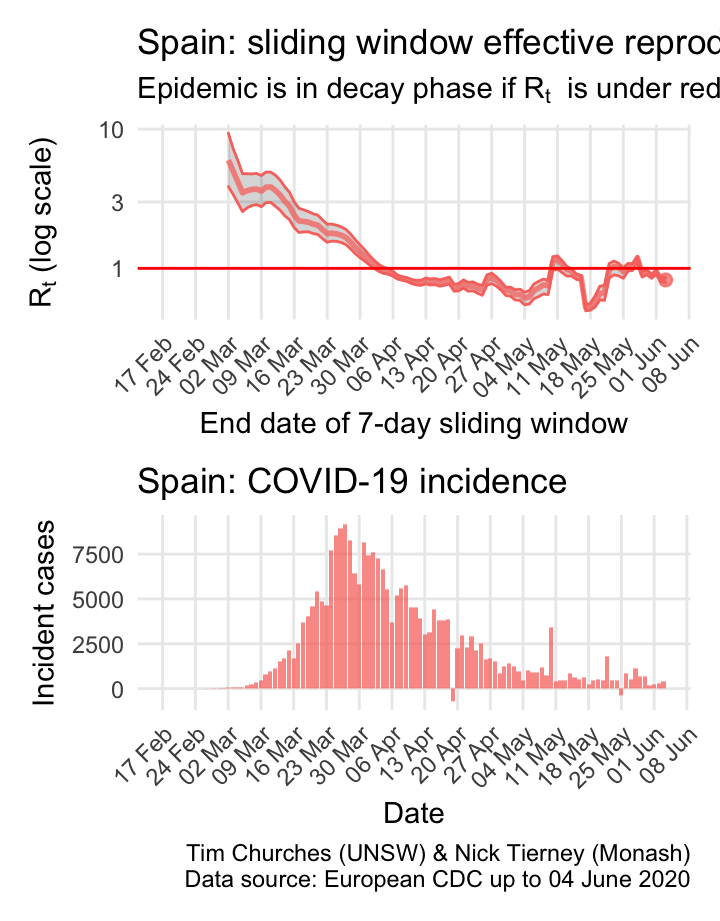
Spain: \(R_{t}\) and incidence
Italy, Spain, France and Germany have all suffered large epidemics of COVID-19, but all appear to have now contained spread to the point that their epidemics are now clearly in decay.
The estimates here use samples from a posterior distribution of serial intervals estimated from the data given by Nishiura et al. using the method of Thompson et al.
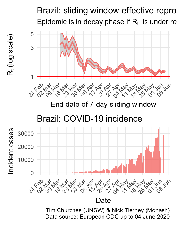
Brazil: \(R_{t}\) and incidence
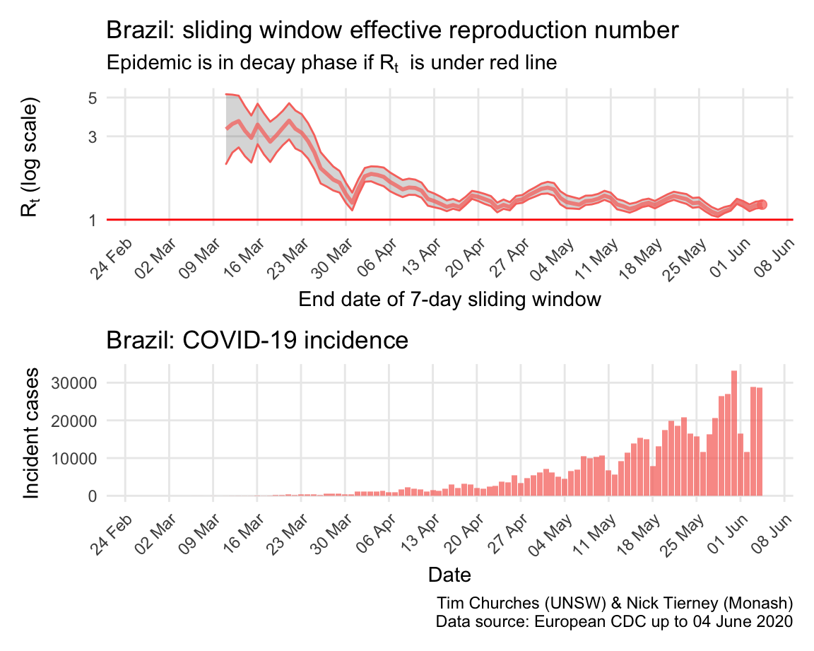
Incidence in Brazil lagged that in most northen hemisphere countries, but now appears to be in the exponential growth phase, with growth slowing only slowly.
The estimates here use samples from a posterior distribution of serial intervals estimated from the data given by Nishiura et al. using the method of Thompson et al.
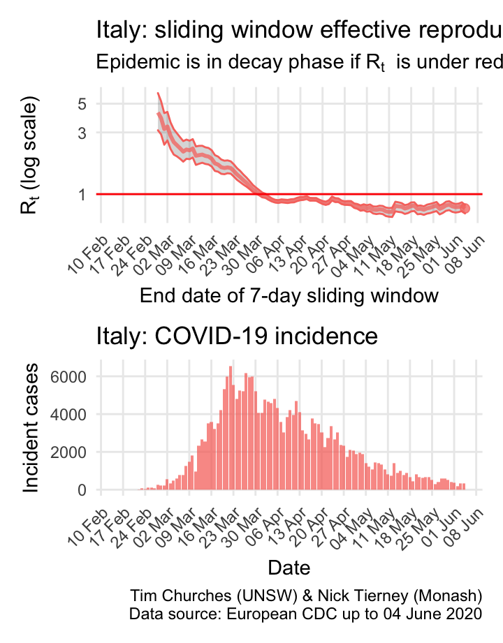
Italy: \(R_{t}\) and incidence
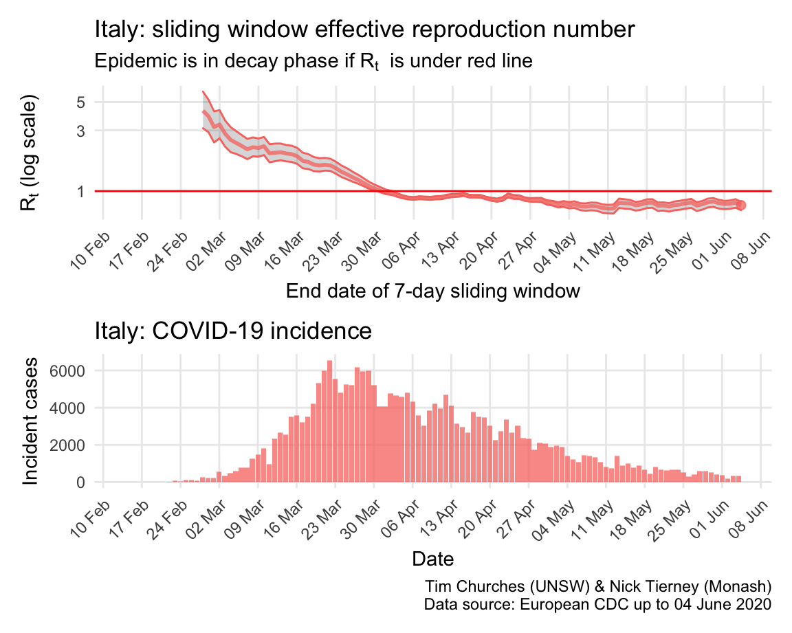
Italy, Spain, France and Germany have all suffered large epidemics of COVID-19, but all appear to have now contained spread to the point that their epidemics are now clearly in decay.
The estimates here use samples from a posterior distribution of serial intervals estimated from the data given by Nishiura et al. using the method of Thompson et al.
Russia: \(R_{t}\) and incidence
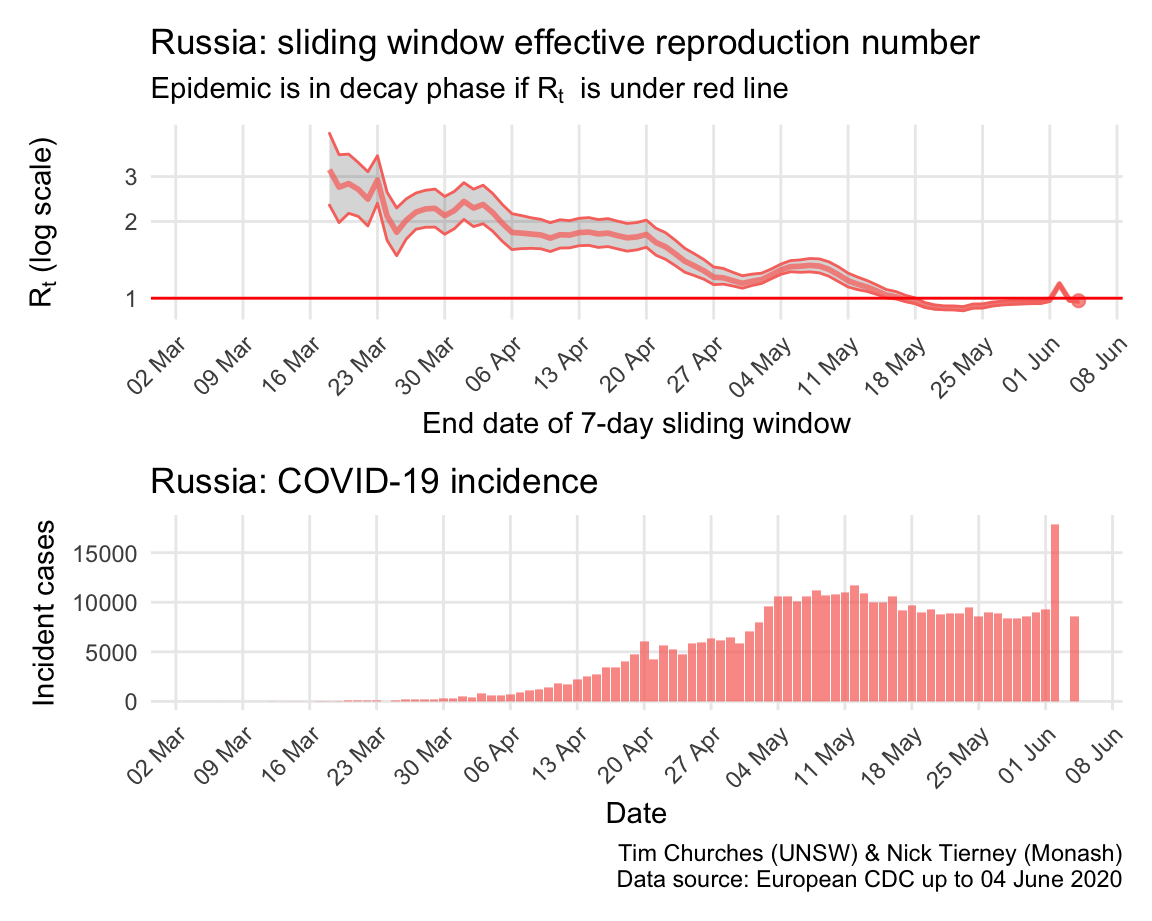
Incidence in Russia was initially very low, possibly due to limited testing, but has since accelerted dramatically, particularly in Moscow, although social distancing and rigorous lock-down is now having an effect and incidence now appears to be declining.
The estimates here use samples from a posterior distribution of serial intervals estimated from the data given by Nishiura et al. using the method of Thompson et al.
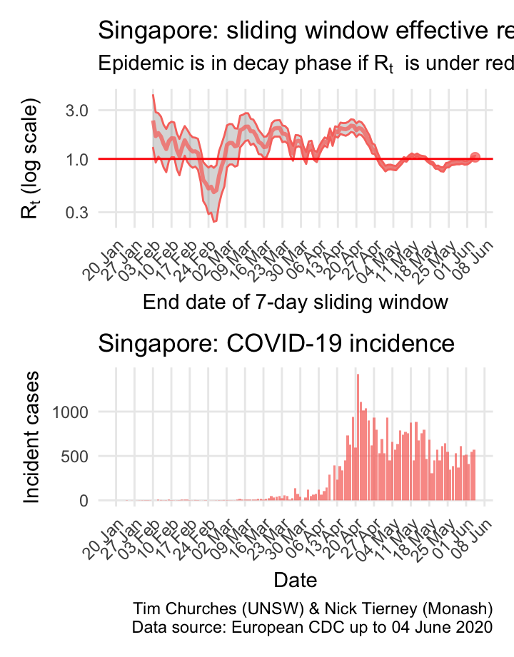
Singapore: \(R_{t}\) and incidence
Singapore was initially a model of how to contain the virus, and has used advanced smartphone technologies to ensure rigorous case isolation and contact quarantining. Nonetheless, the eppidemic escaped control, and they have been struggling to bring it back under control since. The reasons for this late failure of control are important to study, as they hold valuable lessons for other countries (such study is beyond the scope of this website, for now).
The estimates here use samples from a posterior distribution of serial intervals estimated from the data given by Nishiura et al. using the method of Thompson et al.
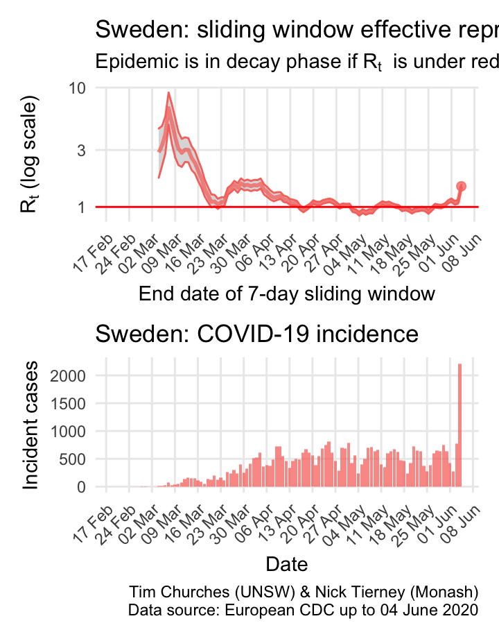
Sweden: \(R_{t}\) and incidence
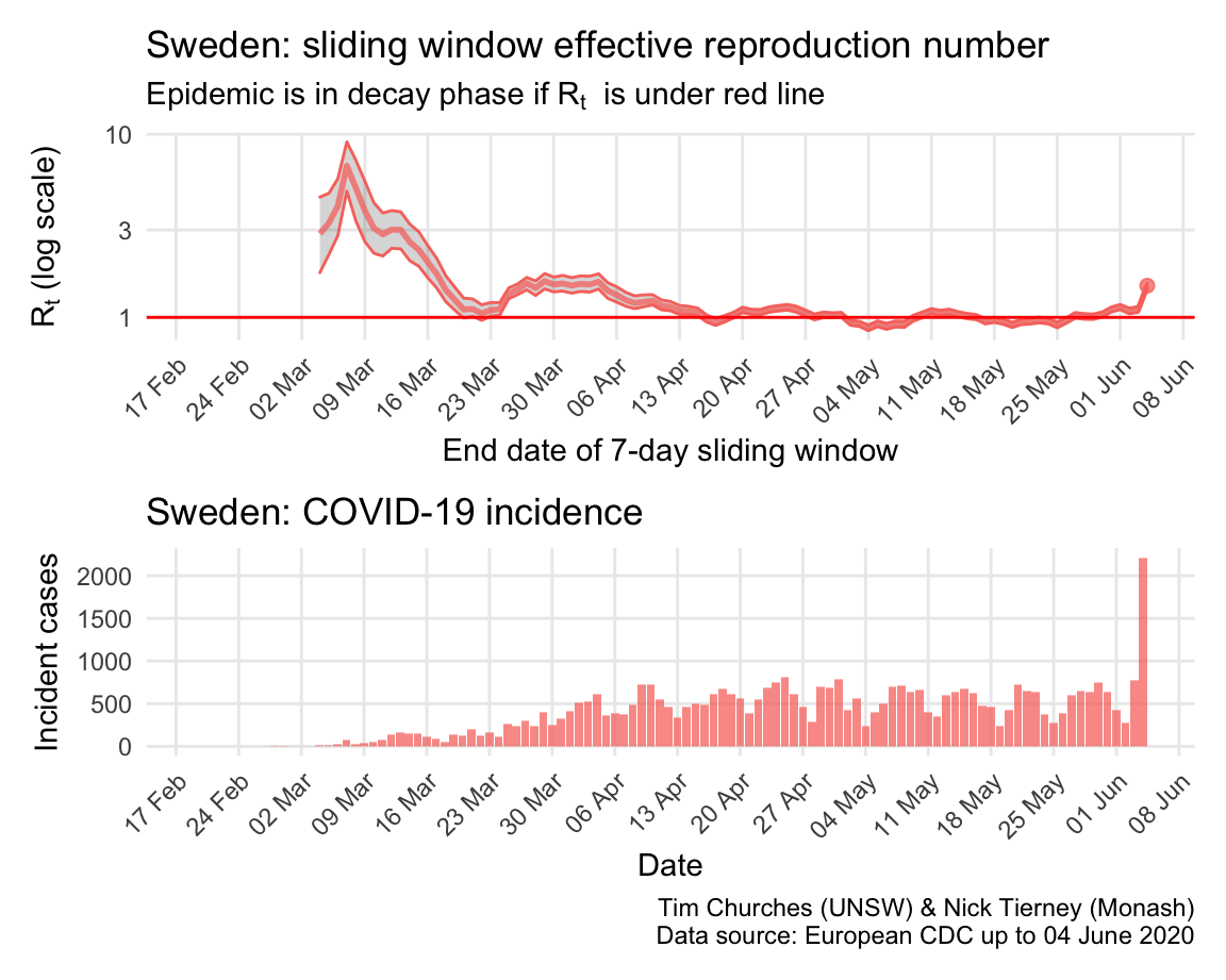
The estimates here use samples from a posterior distribution of serial intervals estimated from the data given by Nishiura et al. using the method of Thompson et al.
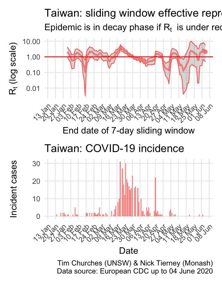
Taiwan: \(R_{t}\) and incidence
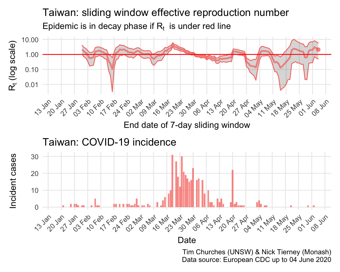
Please see this SMH article for background on Taiwan’s comprehensive and model approach, one which other island states (including Australia, New Zealand and, effectively, South Korea) are seeking to emulate, or should be.
because Taiwan has so few cases, the estimates of \(R_{t}\) are quite unstable, but it is has been a major success story.
The estimates here use samples from a posterior distribution of serial intervals estimated from the data given by Nishiura et al. using the method of Thompson et al.
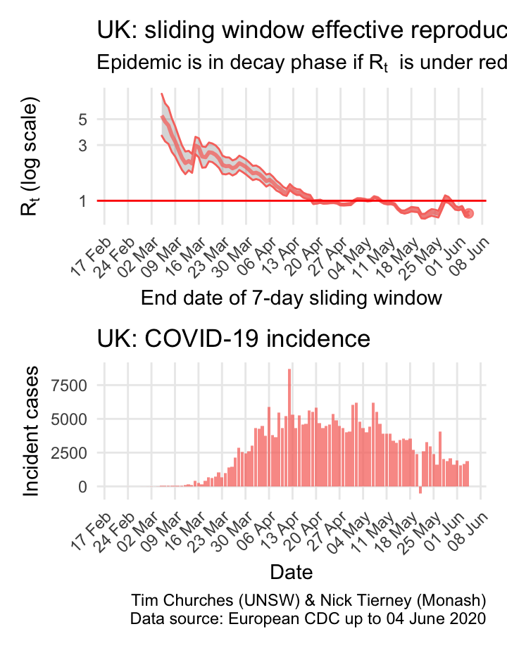
United Kingdom: \(R_{t}\) and incidence
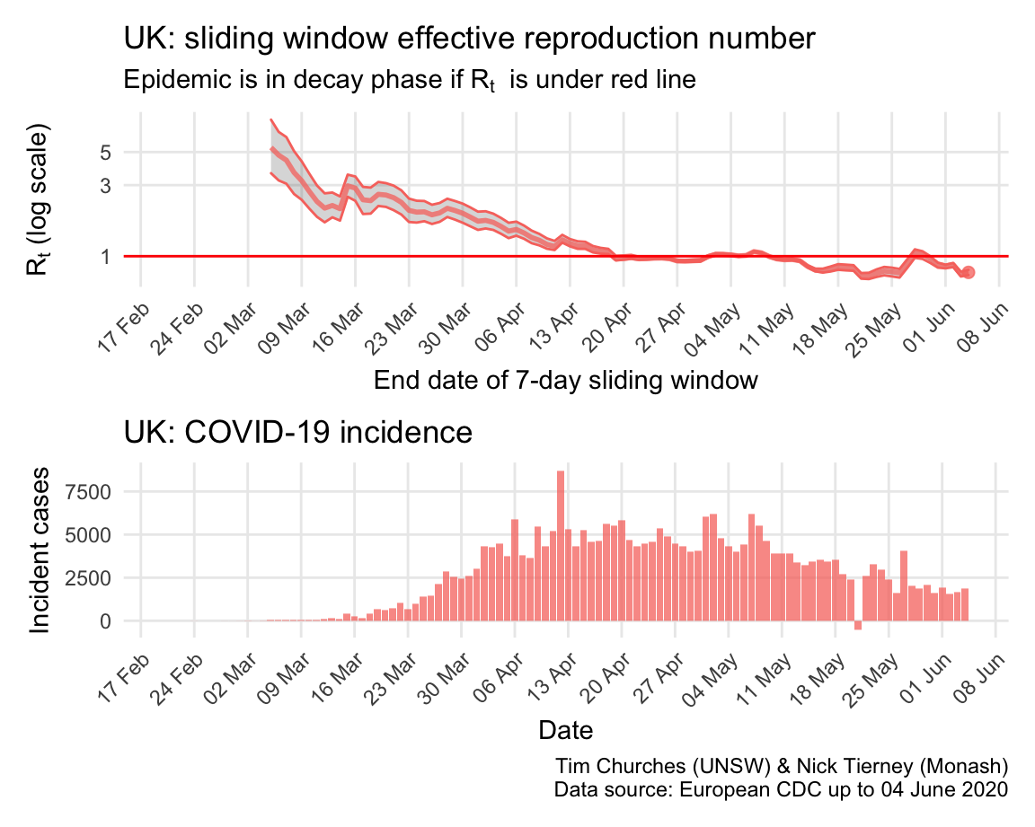
The UK was initially following a “herd immunity” approach, like Sweden, but changed strategy in response to a modelling report released on 16 March by Imperial College London, perhaps just in time to avoid a complete catastrophe. However, Britain is still struggling to bring the epidemic under control, and it appears to have only recently left the growth phase.
The estimates here use samples from a posterior distribution of serial intervals estimated from the data given by Nishiura et al. using the method of Thompson et al.
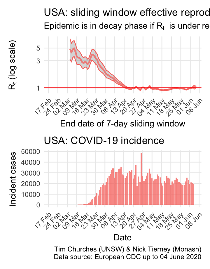
USA: \(R_{t}\) and incidence
The world is aghast at the US reponse to COVID-19 and the results thereof. But they do appear to be slowly reducing transmission, mainly due to extremely rigorous social distancing measures in New York city and state, which is a centre of the epidemic. The recent opening of the economy in the US may yet have detrimental effects on control of COVID-19.
The estimates here use samples from a posterior distribution of serial intervals estimated from the data given by Nishiura et al. using the method of Thompson et al.
\(R_{t}\) for NSW
Explanation
The charts of the time-varying effective reproduction number \(R_{t}\) for New South Wales COVID-19 incidence data are similar to the analyses presented in the previous section, with the important distinction that incidence cases have been able to be divided into locally-acquired cases and cases where the infection was acquired elsewhere (overseas or interstate). This permits much more accurate estimation of the true \(R_{t}\).
This has been enabled by the publication of more detailed data by NSW Health, available on the NSW government open data web site, and updated daily, in conjunction with data derived by counting pixels in NSW Health charts to obtain earlier data (luckily the charts were high-resolution and thus the data extracted this way is very accurate).
In each of the frames in this section, estimates of the NSW effective reproduction number are shown, based on either a parametric serial interval distribution, or a serial interval distribution derived from data collated by Nishiura et al. using the method of Thompson et al.
Frames in which imported and locally-acquired cases are not distinguished in the estimates are also provided for comparison. These are much less likely to be correct than the estimates using split imported/locally-acquired counts.
In addition, frames in which the counts of cases in NSW have been inflated by a factor of 10 for local cases, and by 50% for imported cases, are also presented. This is a sensitivity analysis which mimics the situation in which there is considerable under-ascertainment of cases – that is, only 1 in 10 cases in the community are actually detected.
Technical details
Please see the paper by Thompson et al. for details of the methods used here.
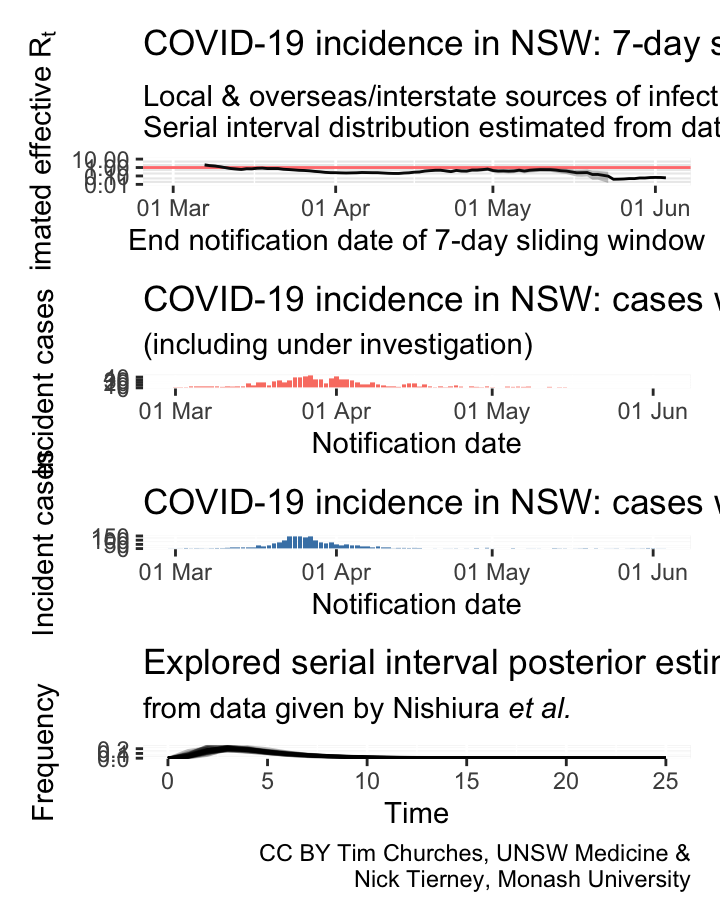
NSW – locally-acquired & overseas/interstate-acquired cases treated separately
(cases under investigation excluded)
parametric serial interval distribution
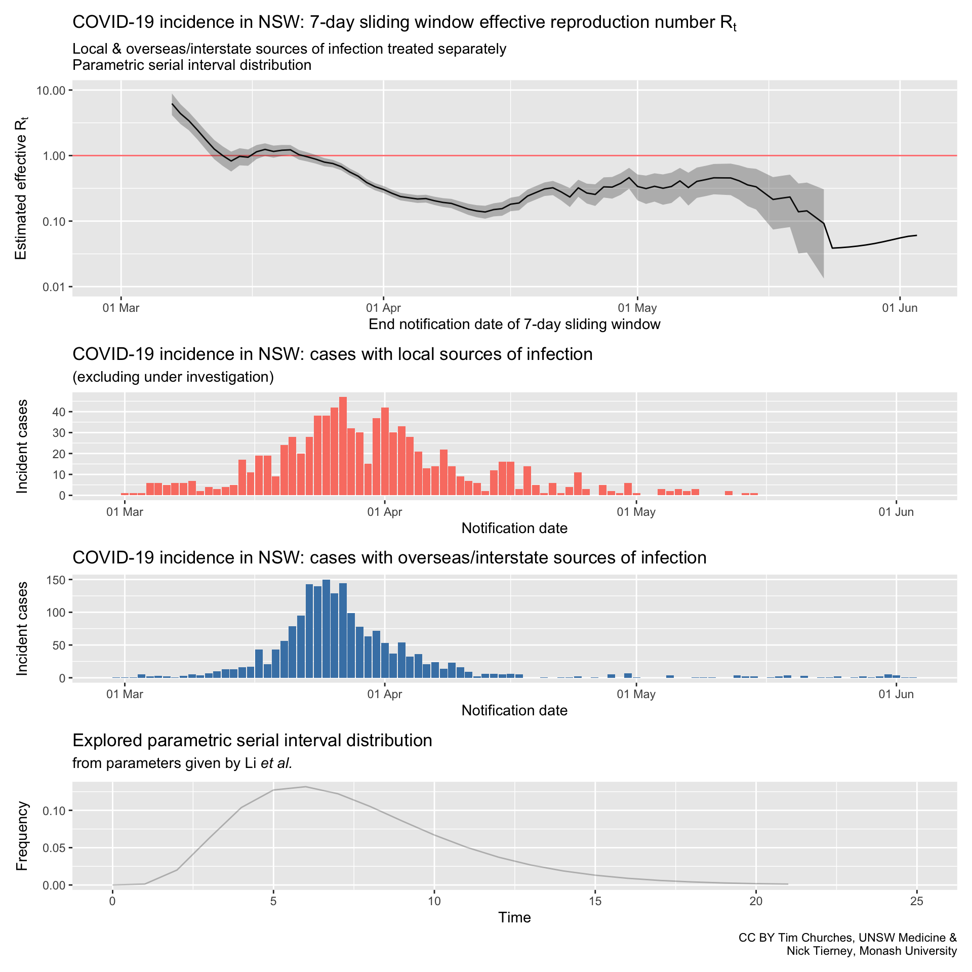
Commentary
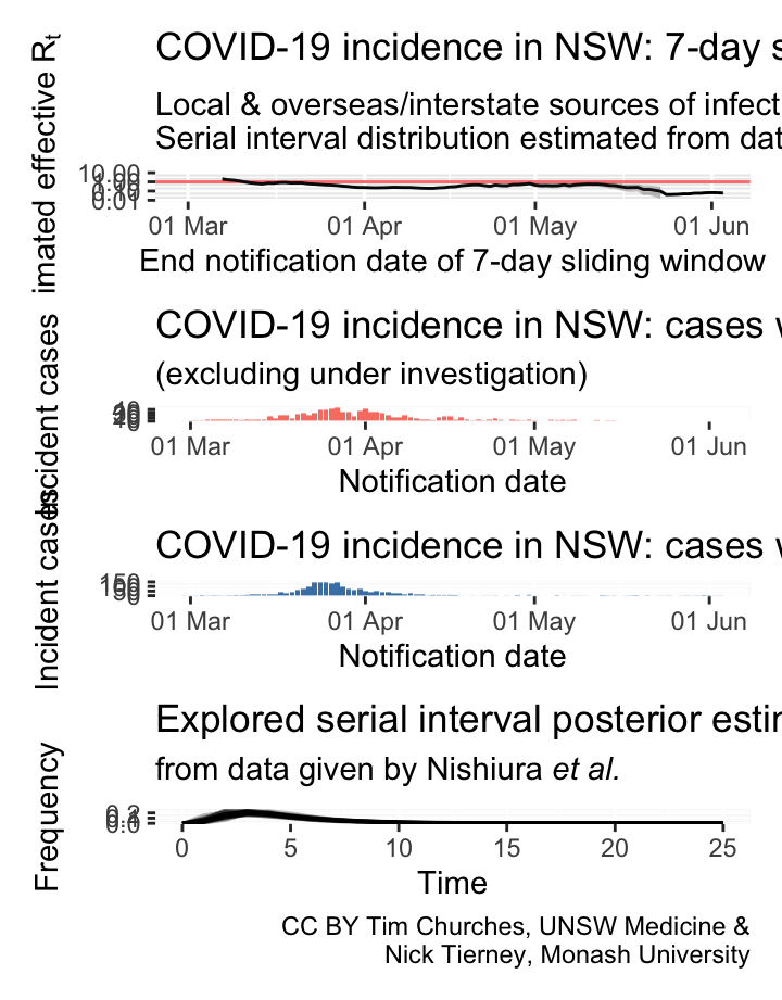
NSW – locally-acquired & overseas/interstate-acquired cases treated separately
(cases under investigation excluded)
serial interval distribution estimated from data

Commentary
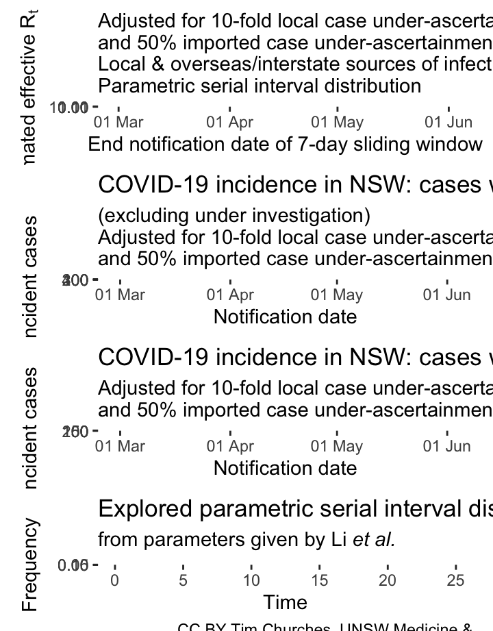
NSW – adjusting for potential under-ascertainment, locally-acquired & overseas/interstate-acquired cases treated separately, (cases under investigation excluded), parametric serial interval distribution
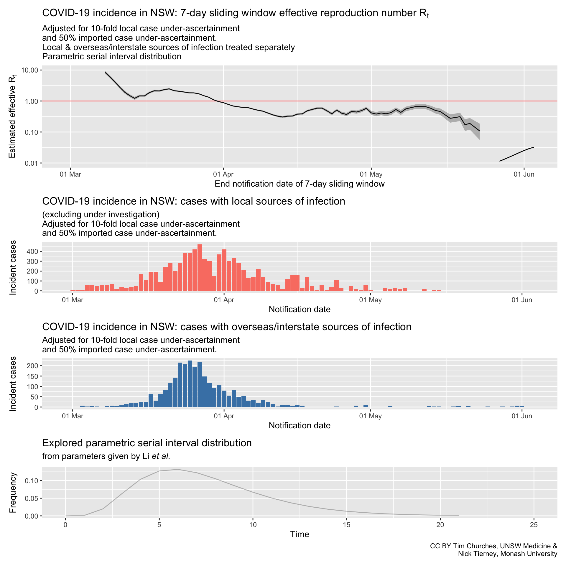
In these plots, the counts of incident cases with presumed local sources of infection have been inflated by a factor of 10, and the counts of cases with presumed overseas or interstate sources of infection inflated by a factor of 1.5. This mimics ten-fold under-ascertainment of locally-transmitted cases, and 50% under-ascertainment of inbound cases.
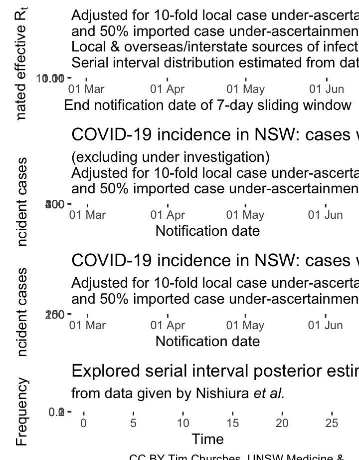
NSW – adjusting for potential under-ascertainment, locally-acquired & overseas/interstate-acquired cases treated separately, (cases under investigation excluded), serial interval distribution estimated from data
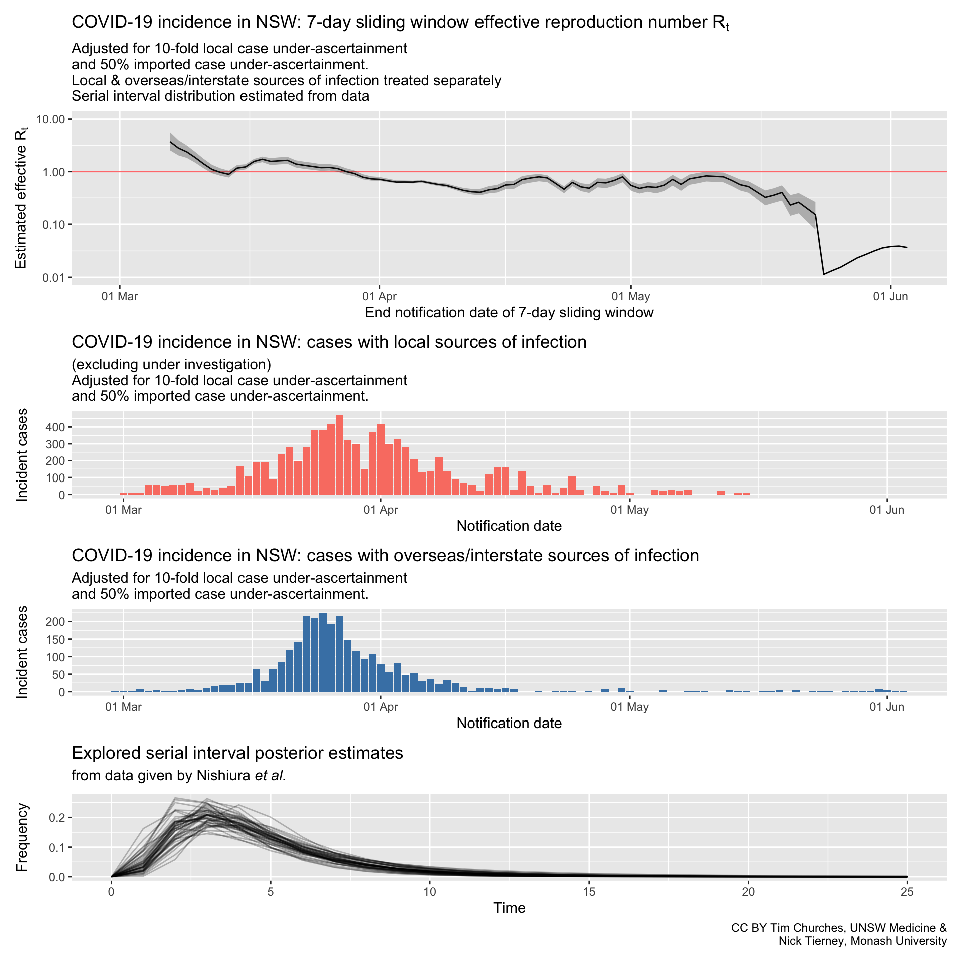
In these plots, the counts of incident cases with presumed local sources of infection have been inflated by a factor of 10, and the counts of cases with presumed overseas or interstate sources of infection inflated by a factor of 1.5. This mimics ten-fold under-ascertainment of locally-transmitted cases, and 50% under-ascertainment of inbound cases.
In fact, so long as the rate of under-ascertainment does not change much over time, it has little effect on the effective reproduction number, which is driven by the number of cases each case infects, not the total number of cases or infectious individuals.
NSW – locally-acquired & overseas/interstate-acquired cases treated separately
(cases under investigation included)
parametric serial interval distribution

Commentary
NSW – locally-acquired & overseas/interstate-acquired cases treated separately
(cases under investigation included)
serial interval distribution estimated from data
Commentary
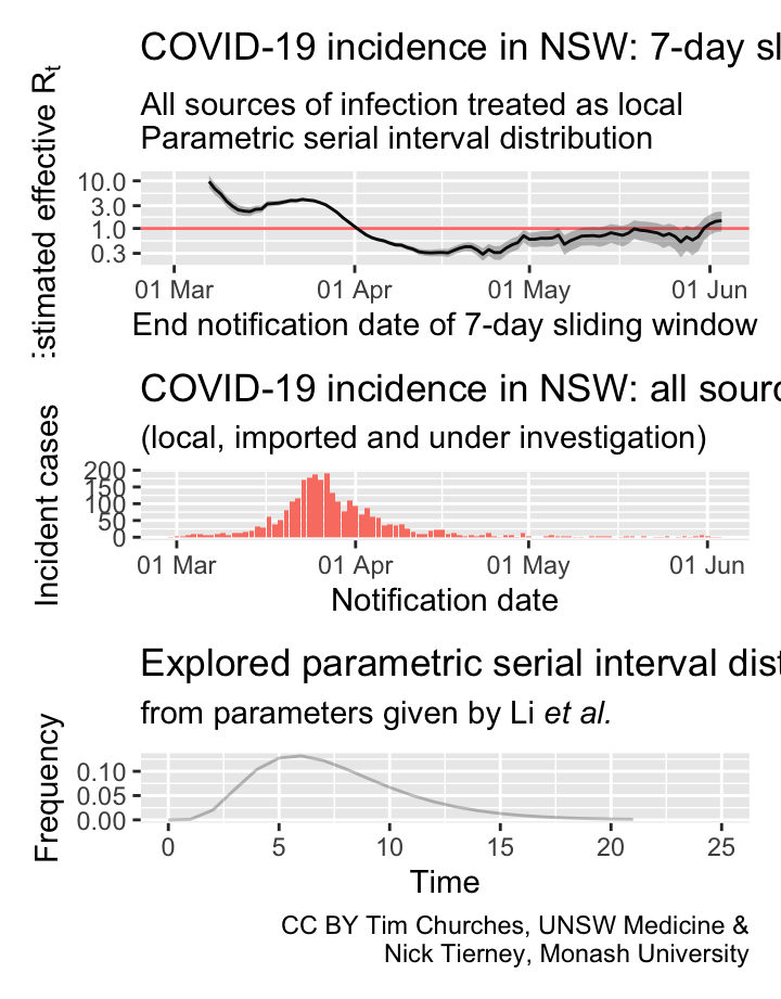
NSW – all cases treated as locally-acquired
parametric serial interval distribution
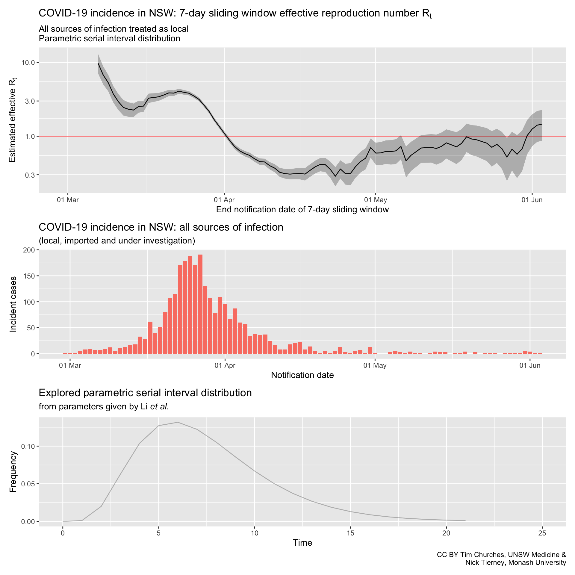
Commentary
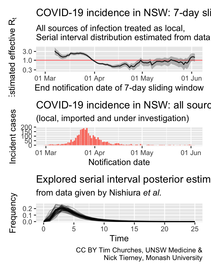
NSW – all cases treated as locally-acquired
serial interval distribution estimated from data
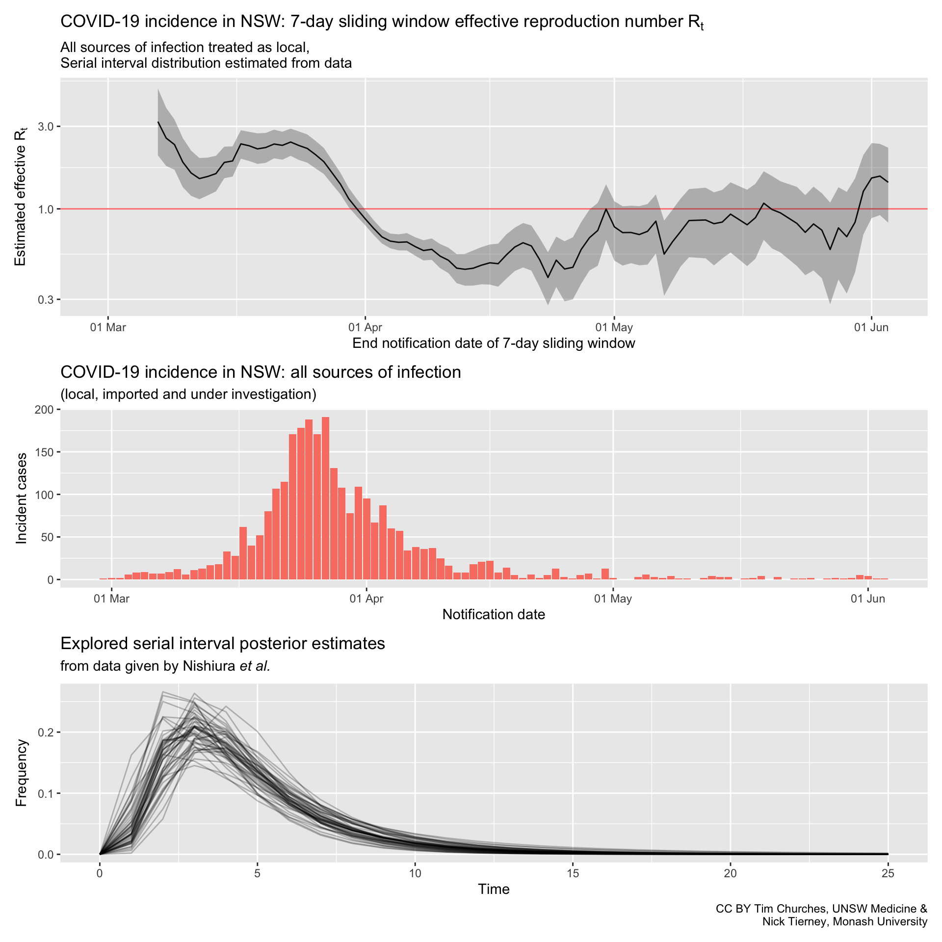
Commentary
GIFs
Please stay at home these Easter holidays
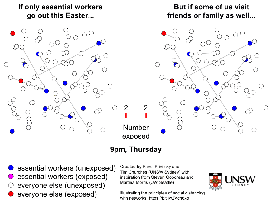
This is a graphic created by Pavel Krivitsky (UNSW Maths and Stats) and Tim Churches (UNSW Medicine) to illustrate the importance of reduced social mixing, particularly over the Easter break in 2020. Further explanation and technical details can be found here.
Flatten this!
A tongue-in-cheek infographic motivated by the observation that, as at 18th April 2020, many people in particular demographics appear to have assumed that the whole COVID-19 thing is over in Australia, and that it’s party time…
Bhatia/Minute Physics chart
This plot replicates a chart developed by Aatish Bhatia in collaboration with Minute Physics. The plot shows, for each country, the number of incident (new) cases on the y-axis, on a logarithmic scale, versus the cumulative total of cases on the x-axis, also on a logarithmic scale. When plotted in this way, uncontrolled epidemics with exponential growth take a linear (straight line) trajectory at some angle. As an epidemic is brought under control, the trajectory drops below the straight line, eventually falling vertically if the epidemic has been completely extinguished.
About this site
Column
Contributors

The content on this site is licensed under a Creative Commons Attribution 4.0 International License. If you wish to re-use any of the content, please retain the attribution which appears on each chart or set of charts, or otherwise provide that attribution alongside the content that you re-use.
In turn, we acknowledge RECON for making their fantastic R packages available, and the European Centre for Disease Control who provide up to date data on the COVID19 pandemic.
Project is initiated and led by Timothy Churches (South Western Sydney Clinical School & UNSW Centre for Big Data Research in Health, UNSW Medicine, and the Ingham Institute for Applied Medical Research). Nicholas Tierney (Monash University Econometrics and Business Statistics Research Group) is the co-lead, and has contributed much of the code and contributed to the documenation and commentary.
We also thank Stuart Lee, Elliot Zhu (UNSW Centre for Big Data Research in Health), Dianne Cook, Miles McBain, and Rob Hyndman for their helpful comments and contribution of R code (some of which is yet to appear).
Visualisations and analysis code are available in the covidrecon package.
Source code for this web site is available at covid-flexdashboard.
Technical Details
Data Analysis has been entirely created within the R programming language using Rstudio.
Code for this web site can be found at https://github.com/CBDRH/ozcoviz and is archived via the DOI shown below:
![]()
This web site also uses code contained in the covidrecon package which can be found at https://github.com/CBDRH/covidrecon and is archived via the DOI shown below:
![]()
Packages used include:
- flexdashboard
- tidyverse
- magrittr
- countrycode
- janitor
- scales
- readxl
- httr
- glue
- EpiEstim
- changepoint
- ggrepel
- memoise
- patchwork
- datalegreyar
- memoise